


Looks like Shinnoks wallpaper from MKA.

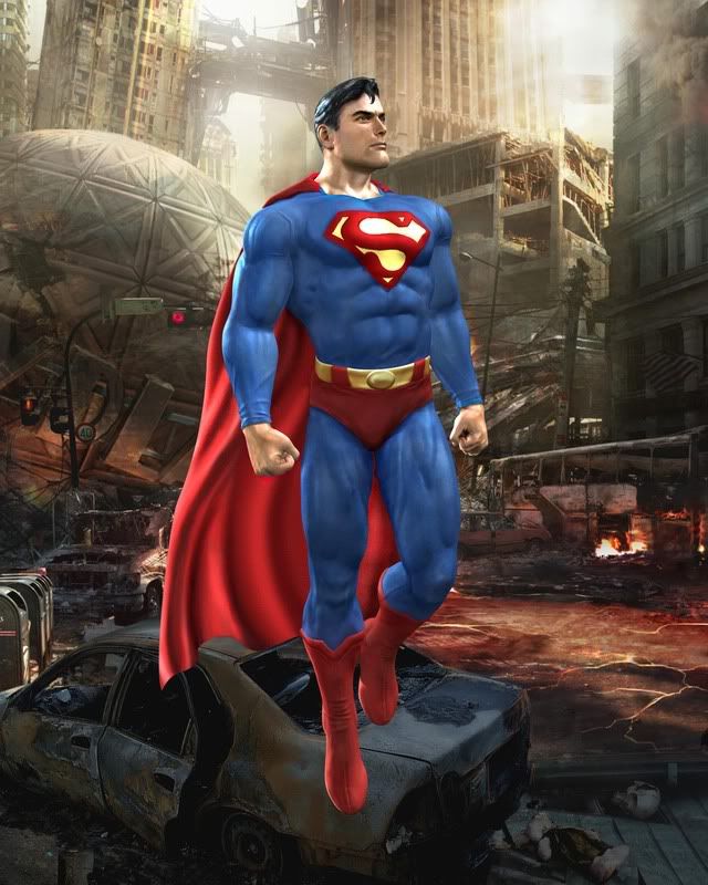
The model is fine. The texturing leaves a lot to be desired. Look at his hair. It looks like if you knock on it you'll get a hollow sound.
So does his chin.


The model is fine. The texturing leaves a lot to be desired. Look at his hair. It looks like if you knock on it you'll get a hollow sound.
I stand corrected.
And his hair does look bad...really bad.
As bad a taste as it is to judge before the game's released, I'm gonna go ahead lean towards "they're pulling our chain" until further notice.
Looks like Shinnoks wallpaper from MKA.
Exactly.
I uh...see the same amount of polygon-smoothness and texture detail the Scorpion render had. Do you guys even own any PS2 games? Do you know what you're talking about? Because I kinda doubt it.
QFTR....and agree
PS2? lol...right and I'm the president of freaking Russia.....
The fucking costume even has "ripples" and "details" and wrinkles within it, hell it even looks like spandex. You couldn't see those kind of details with PS2 graphics which were shitty(even GC graphics were better then PS2 specwise)
I mean I'm not saying it's the absolute best looking thing in the world but to say this looks last gen or PS2 especially is just dumb IMO lol. That post that Tiger posted concerning JL Heroes, that looks alright and looked better for Xbox and I've played that game. Good game, But notice they also made Superman especially look more like "Superboy" rather then "Superman" in that game, he looks more mature in this game like actual "Superman" and has the vague facial hair/details, which I like. His face/hair could be a little better I'll admit but his costume details I have no problem with and overall looks pretty good. Not as cool as the Scorpion one but definitely not shitty either.....
Now as far as a general statement concerning the Superman Render. Supes looks good, as far as his "boyscoutish look appeal" that won't change the DC or Superman haters so I really don't give a shit who likes the costume at this point. That's Superman, accept it or don't. Remember, Midway has to create the DC guys EXACTLY how DC wants them to look. If Midway wanted to add more hair or effects, guess what? They can't unless DC approves it officially...... Nobody cares to hear more pointless banter about it "it's gay" blah, blah. Thanks
Besides, I'll almost bet anything he'll have a darker costume as his alternate assuming there will be alternates. So hopefully that look will appeal more to the "Superman iconic look haters"
And for anyone saying that render looks bad is either blind, or.....well I can't think what else, you must just be blind. No DC character, including Superman, has EVER looked that awesome in a game, and when it comes to fighting games, for in-game models, that's just as good as anything coming out. That is an IN-GAME RENDER PEOPLE. That is amazing for in-game. That render from Justice League Heroes was NOT in game, that was the opening movie, or a cut-scene. It looked nothing like that in-game. This Superman render is in-game, and I gotta give respect to Midway for making DC characters look THIS good. I personally can't stand DC heroes for the most part, I grew up on MARVEL comics, but I can't wait to get this game.
What an unbelievable year this is going to be for gamers. I've never bought as many games in a year as I will be this year. Never even half as many. I got Gran Tourismo, GTA4, I'm gonna get MGS4, Battlefield Bad Company, mabey HAZE, Soul Calibur 4, Socom, Legendary: The Box, Star Wars The Force Unleashed, Fallout 3, Street Fighter 4, Motorstorm 2, Resistance 2, LBP, Home (hopefully), MK vs DC, there are a couple others I'm forgetting as well. Then I get to top off the New Year with Killzone 2. What a Year !!!!
http://static.highend3d.com/galleryimages/431/screen.jpg
Whos that guy that makes all the scorpian render MODS? You should transform the superman render into that pic of bizzaro if you wanna mess around.
What do you like? Hit the Toasty thumbs up on articles and forum posts for a quick response!
Yea, it looks like the great Alex Ross' paintings, and for good reason. The DC Heroes never looked better than when Alex Ross paints them, and Ed Boon has already stated that the DC heroes in the game are going to be based on Alex Ross' designs, and style.
There's nothing particularly Ross about the design or detail of the render.
From what I saw, Boon never mentioned Ross as the basis of any inspiration. He was definitely mentioned in a list of realistic and respected sources intended to pacify the inevitable backlash, but as a reference source? I think the design debunks that pretty swiftly.
Ross inevitably puts a lot more detail and character into his figures and faces, sometimes to their contemporary detriment.
Rarely does he make the characters look as youthful as MK's Superman.
It strikes me as very Routh, but with a squarer jaw, which is why it looks a little odd, I think.
the model looks pretty detailed...its just not a MK type of look. I would suggest making the suit a darker shade of blue and red, but .then it wouldnt be superman.
More often than not Superman is coloured darker than the render.
A deeper blue and red would be a great start.

TonyTheTiger - Forum Director

Mortal Kombat Online - The Ultimate Mortal Kombat Experience
-
Nintendo is comprised of three Japanese words. Nin, Ten, Dou, and when combined it means we kicked the holy shit outta Atari.
Unreal 3:

Unreal 3:

Unreal 3:

Unreal 3:

One of these kids is not like the other!
One of these kids is not like the other!

You think THAT looks better than the Supes render?
Seriously?
You're fucking with us, right?
I mean...if you had only posted the first of those images, you'd have an argument. But the third looks the damn same and the second looks flat-out worse.
All you've proven here is that the Unreal 3 engine isn't anything special. It looks like any other fucking video game.
Yea, it looks like the great Alex Ross' paintings, and for good reason. The DC Heroes never looked better than when Alex Ross paints them, and Ed Boon has already stated that the DC heroes in the game are going to be based on Alex Ross' designs, and style.
There's nothing particularly Ross about the design or detail of the render.
From what I saw, Boon never mentioned Ross as the basis of any inspiration. He was definitely mentioned in a list of realistic and respected sources intended to pacify the inevitable backlash, but as a reference source? I think the design debunks that pretty swiftly.
Ross inevitably puts a lot more detail and character into his figures and faces, sometimes to their contemporary detriment.
Rarely does he make the characters look as youthful as MK's Superman.
It strikes me as very Routh, but with a squarer jaw, which is why it looks a little odd, I think.
the model looks pretty detailed...its just not a MK type of look. I would suggest making the suit a darker shade of blue and red, but .then it wouldnt be superman.
More often than not Superman is coloured darker than the render.
A deeper blue and red would be a great start.
I respect Ross's work but I think personally he makes Supes look way too old lol. That kind of turns me off, in the game Tiger listed he looked "too young" in Ross's concepts he looked too old, the MK one kind of looks like he's in his 30's-early 40's which I like.
I also take it you have something against Routh's Superman? I liked the way he acted Superman out, but honestly felt he was a tad bit too young IMO. I would have preferred Welling personally. I'm sure his alternate will most likely be the black costume or one of his rarer costumes perhaps that he's sported here and there in the DC universe.
I'm a little puzzled wit this plasticness theory, they don't look plastic at all to me. I can understand last gen MK games the characters looking "cartoony" themselves, but plastic? Just wanted to also point out that Tiger, the second pic the dudes nose doesn't even look open like a real persons nostrils...they looked closed or slightly indented.....not "that great" if you ask me.
TonyTheTiger - Forum Director
Mortal Kombat Online - The Ultimate Mortal Kombat Experience
-
Nintendo is comprised of three Japanese words. Nin, Ten, Dou, and when combined it means we kicked the holy shit outta Atari.
You think THAT looks better than the Supes render?
Seriously?
You're fucking with us, right?
I mean...if you had only posted the first of those images, you'd have an argument. But the third looks the damn same and the second looks flat-out worse.
All you've proven here is that the Unreal 3 engine isn't anything special. It looks like any other fucking video game.
Don't confuse the blurriness and size of the image for actual texture quality. The skin and hair textures in Gears of War do not look as obviously plastic. And, hell. Commander Shepard up there clearly shows Midway is taking a dive on this one. I have more than an argument. I have proof.
By the way, about Superman's age. He's traditionally been shown to be roughly 28-35.
And for anyone saying that render looks bad is either blind, or.....well I can't think what else, you must just be blind.
You forgot about the "might actually be more knowledgeable about this, than you" option. "Blind" isn't the only possibility if there is a distaste about graphics man. Begs to question who's actually allowing themselves to be blind is all I'm saying.
And anyway...Why do I keep seeing people try to convince themselves about these things?
Using statements like "for a ___ render it looks awesome". Doesn't that sound a bit be-littling of ones expectations? Don't you think it should be undeniable regardless of the character? i.e. "Graphics look fantastic, but the character design is just boring."
Shouldn't that be more appropriate a statement venture, considering the witnessed output of previous incarnations of this engine, and the competitions output via they're own "built from the ground up" engines? Gotta wonder what the MkTeam "highly modified" the URE3 to...
Oh, and how do you know this is in-game material? I'd really like to know.
=================---------------------==================
Here we go, from the rant thread and various other places:
...Call it...call it "Wipe the Slate Clean".
"Gameplay".
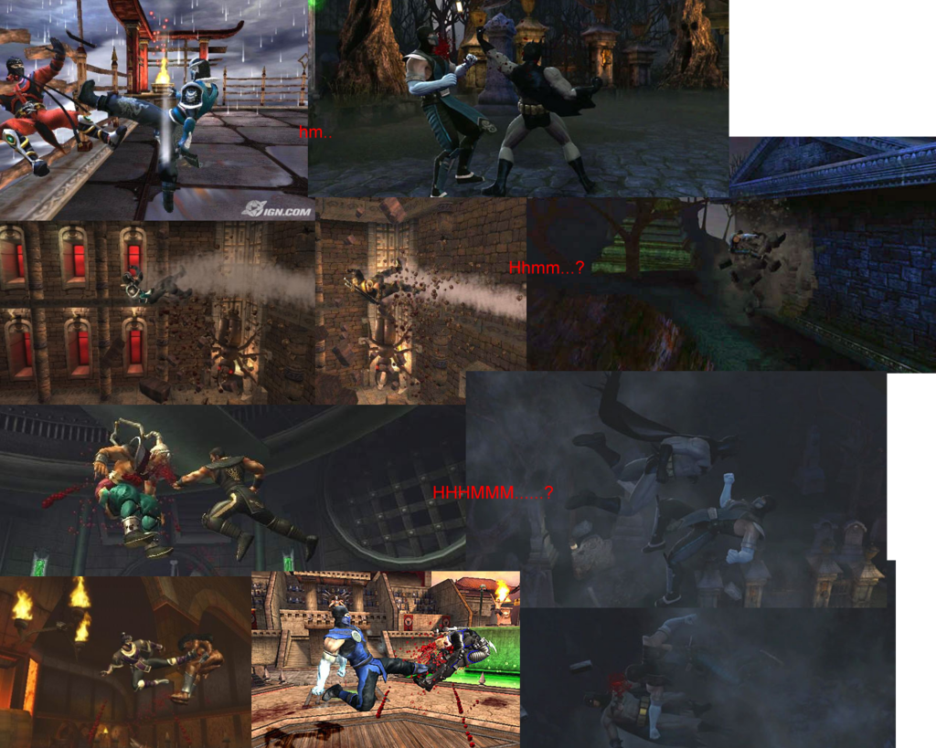
No real dispute on the in-game graphics but, Rendered Graphics beg to be questioned. Meh, I'll post those comparisons too. Looks like the same thing gameplay-wise too. Be easy MKF, just making a hardy observation.
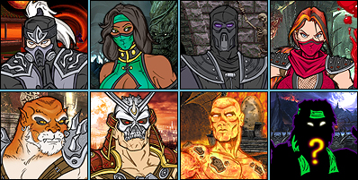
1. Old compared to new. MKA Shinnok vs MKvsDC Scorpion Graphics.
2. UnReal Engine 3 Comparison.
3. Mitsurugi Comparison.
4. If it's in-game, here's a comparison. Mitsurigi in-game.
5. Another In-game comparison. Fighting Genre.
6. Tekken 6 Jin vs Scorpion MKvsDC
7. Virtua Fighter 5 Comparison.
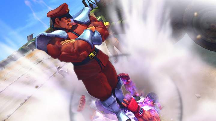
8. Street Fighter 4 Comparison
One of these kids is not like the other!
One of these kids is not like the other!
Ha! I'm saying man...come on people.
heheh..
TonyTheTiger - Forum Director
Mortal Kombat Online - The Ultimate Mortal Kombat Experience
-
Nintendo is comprised of three Japanese words. Nin, Ten, Dou, and when combined it means we kicked the holy shit outta Atari.

BunnyHaetsU - Ramblings of a man who probably shouldn't be allowed into society.
I do have a few things to say though after checking out a few of your comparisons that I noticed.
I looked at a few but would also like to comment on a few things I noticed.
The one with Scorpion vs. Jin, I noticed in the faces of both. Jin(being alive) looks alive and Scorpion(being dead/undead countless times) actually looks dead. You can clearly see this in the face of detail in both games. I think they both look good.
Now, a few things concerning the fighting in game comparison shots.
The SC one, for the most part everything looked good but did notice I think that's Cervantes? With the sword, the way he's holding it looks like he's not "gripping" it and just caressing it rather...like it's in his hand but he's not "gripping it tightly" Obviously in the other games, even MK vs. DC we can't compare that notion since there's no weapons being held in any of those shots.
Another thing I noticed, about the SF4 one Ryu. His feet look way too big and slightly out of proportion IMO for his costume, almost as if he's "the hulk" busting out of his costume if you really look at it, it looks like that a little bit. Feet look too big IMO.
The rest including MK I really don't think that drastically "different" graphic wise from each other. I mean Jin has nice detail on his chest, nipples etc and Scorp has hot details as I've said a few times now with his clothes, blood stains on his gi, damaged shoes and face etc.
BTW, I noticed you didn't post DOA4 in there also. That game looks pretty good too.

To get something you've never had you must do something you've never done.
Listen, the Scorpion render looks infinitely better than this Superman. If the real time texturing was what it's like in the Scorpion render (something Unreal 3 can definitely do) I wouldn't have a problem. Right now it seems that by using Unreal 3 they're taking a jackhammer to a thumbtack.
Agree...but disagree too.
The Scorpion looks better texturally than previous versions of himself. Other than that it's the same hand crafting the quality.
For instance, on the Scorpion and Superman here, both have alot of one-dimensional qualities throughout their costume designs. Wherever there should look like the body curves....it "cuts off". Supermans midsection does this, Scorpions shoulder guards do this.
They put more "photoshop" hours into the the Scorpion, but there is no greater depth, no greater definition than the Superman. They're the same in that graphic respect.
There's also the issue of real skin textures, differences in cloth, and metal textures...all that stuff should not look like it was layer to death in order to get that look.....I make that mistake when I make sigs and stuff. But I'm not schooled(yet) for 15+ years like they are...
Just makes me kinda happy they made this Superman mistake.
There's more, there's alot more that can be seen. Just gotta be looking at it right to see the "tricks" they pulled. Scorpion, Sub-Zero, Batman, and Superman.
They're all terrible for "next-gen" quality.
Let's face it, you either hate him or love him and this site for the most part has a majority falling in the "hate" category. I just feel that in Supes case, he could have looked "the best" thus far with the renders and he'd still be shitted on.
Exactly! Or the one from the comics, which looked similar but there were some with a cape too
Secondly I don't like the face 1 bit, his alternates better be his black costume (the 1 from the end of the Superman returns saga w/ long hair), and his newer capeless version (the 1 with the futuristic 'S').
[edit]:To clear things up a bit I mean Superman blue costume (the 1 with lighting).


Could be better though, but still holds it's own. It's not as bad as ppl say it is.
Another thing I noticed, about the SF4 one Ryu. His feet look way too big and slightly out of proportion IMO for his costume, almost as if he's "the hulk" busting out of his costume if you really look at it, it looks like that a little bit. Feet look too big IMO.
I'm pretty sure Capcom's artists always draw Ryu with big feet, just like Chun Li's legs are always freaking massive. It's an artistic choice made to depict a character with strange proportions because it makes them look more cartoonish.


