


- Parts of Quan Chi's costume that glow in neon, especially the shoulder spikes. Just looks so bad and out of sync with the rest of the costume.
- Scorpion's and Sub-Zero's arms are hilariously bulky. S-Z's costume overall just doesn't do it for me this time and Scorpion's generic fireball projectile is so plain and boring, wish they would remove that move.
- I'm not feeling Ermac's floating. Wish he would walk in at least one of his variations.
- Don't like Kung Lao's buzz hat that much, but it's not that bad. The visual special effects on his spin move don't do it for me either, it looks like wind whereas before it looked like an energy shield which I liked better.
- Green and yellow lights don't fit Kano, imo.
- Don't like the new animation and looks of Reptile's forceballs. Actually all of his acid moves don't look that good to me, but apparently at this point he (like Kitana) isn't as much finished as other revealed characters.
--- --- ---
However, overall, the game is looking really impressive and I'm very satisfied and excited. Wish they would work a bit more on screen hood elements to make it more diverse from Injustice.
0
FROID Wrote:
too bad he was confirmed as good in that game.
Ferra should keep those feathers on her head.
I also noticed, during the stream, that Kano had red lights during his kutthroat variation, instead of green.
Turok5000 Wrote:
yeah, his current look doesn't really match and I actually thought he was Noob at first! I like Ermac's MKD face wrap design better than the hood. He looked more menacing back then and it actually looked like thousands of souls were wrapped inside him.
yeah, his current look doesn't really match and I actually thought he was Noob at first! I like Ermac's MKD face wrap design better than the hood. He looked more menacing back then and it actually looked like thousands of souls were wrapped inside him.
too bad he was confirmed as good in that game.
Ferra should keep those feathers on her head.
I also noticed, during the stream, that Kano had red lights during his kutthroat variation, instead of green.
Isn't the feathers on Ferra supposed to be part of her variation forms? I hope they also change the lights on Kano! I thought it was hilarious how he changed from red and green like a traffic signal!

- Ermac: I thought his alt costume in MK9 was arguably the best costume in the whole game so I'm very glad to see a similar look for him in this game, I'm neutral toward the uncovered face. What bugs me about him is his physique, I don't mind male characters that are not buff but ever since MKD Ermac has been portrayed as a somewhat short stocky character and I really liked that about him, now he looks tall and lanky. I'll get used to it as overall I was impressed by him but it is quite different. Also he relies on his telekinetic power just a bit too much, I think a few physical/power moves like we've seen from him in Deception and MK9 would spice things up.
- Kitana: her new look is excellent compared to the embarrassment that was her MK9 costume, even the hammer pants are not so bad though I would modify them if I had any say in the matter. Another minor issue is that Kitana has lacked a feminine physique since her MKvsDC appearance, that is fine if they're going with an athletic female type body but then she looks a bit too.... "top heavy."
- Kano: I realize the different variations entail slight tweaks to a character's appearance but I'm not digging the yellow and green lights for Kano, I think he should have red lights in all variations and something else about his appearance should be tweaked.
- Cassie: If they could give her the face and hairstyle she has in the comic that would be a vast improvement imo.
Sub-Zero: only one minor quibble, as others have mentioned the new awkward positioning of his head in his stance, the downward look from before was better.
I have no issues with the following: Kotal Kahn, FerraTor, Scorpion, Reptile, Kung Lao, Quan Chi, Goro, D'vorah

About Me

0
OttoVonRuthless Wrote:
Im surprised people are having issues with Sub Zero's mask, I think its his best one yet, In my opinion its my favorite Sub Zero design.
Im surprised people are having issues with Sub Zero's mask, I think its his best one yet, In my opinion its my favorite Sub Zero design.
Actually I agree. Love his look overall.
About Me

0
I don't have any beef with any design choices in particular. But I don't like that each variation NEEDS a visual aid for some reason. There are some really cool add ons for the costumes like Cassie's shades, Kung Lao's Buzzsaw hat, and Raiden's Lightning hat. But because they are assigned to specific variations, you cannot have those accessories outside of that variation.
That to me, is a poor design choice.
That to me, is a poor design choice.
About Me
0
Sub-Zero: only one minor quibble, as others have mentioned the new awkward positioning of his head in his stance, the downward look from before was better.


About Me

0
Solifuge Wrote:
I don't mind male characters that are not buff but ever since MKD Ermac has been portrayed as a somewhat short stocky character and I really liked that about him, now he looks tall and lanky. I'll get used to it as overall I was impressed by him but it is quite different.
I don't mind male characters that are not buff but ever since MKD Ermac has been portrayed as a somewhat short stocky character and I really liked that about him, now he looks tall and lanky. I'll get used to it as overall I was impressed by him but it is quite different.
I'm irrationally thrilled at the fact that I'm not the only one who noticed this.
Anyway, his new look is growing on me. I don't mind that his face is showing because it actually humanizes him a little, and his slim build makes sense for a mystic character relying more on levitation. I just hate that he looks too young. It's reminding me way too much of some dopey fan art I've seen on DeviantArt. He should look more grizzled or haggard in some way, because housing souls 24/7 isn't exactly a stress-free operation.

0
MileenaFanMKX Wrote:
Reptile's energy balls look awful compared to the MK9 ones.
I also don't think it makes sense that Kotal cuts the opponent's chest in his fatality and then punches a hole in it. Totally pointless and useless. I think it'd look better if he took the heart out from the hole he already created.
Reptile's energy balls look awful compared to the MK9 ones.
I also don't think it makes sense that Kotal cuts the opponent's chest in his fatality and then punches a hole in it. Totally pointless and useless. I think it'd look better if he took the heart out from the hole he already created.
Reptile's ball, I feel it's not fully realized yet. I have faith that it will look better by release. Also, Kotal totally *does* tear the heart out of the opening he creates with his knife, but the hole obviously opens a bit more because he's shoving his big ass fist into the open cavity.
The only thing really bothering me is a lack of personality regarding those character select boxes. No background, no cool posturing. I know the focus is the gameplay, but c'mon.

About Me
 This beautiful sig was made by MINION.
0
Keep in mind that none of these nit picks I'm about the mention deter the overall enjoyment for me.
I love the shredded cloth hanging over Ermac's face; what I can't stand is the face itself. While it's always been covered you can tell that he has always had a normal face. Now his face looks like Legacy Ermac, which I don't like.
I don't care for Raiden's design. Something is very off about his outfit aside from it not looking regal enough I can't quite put my finger on it. I also don't like that they didn't keep the face design he had in mk9 and dc.
I'm sure there is more I can't think of off the top of my head.
0
I hate that Kano's knives have doubled in size and are now latched onto his back. It makes them look much more like small swords than knives. It was so much more badass when he pulled them out of his ankle like the psychotic Aussie hunter that he is. But I can live with it I guess.

About Me
0
charlesadamst Wrote:

Sub-Zero: only one minor quibble, as others have mentioned the new awkward positioning of his head in his stance, the downward look from before was better.
More like:
Before: "Oh, look, a penny."
After: "Neck spasm."
I don't know how him looking down at the ground makes him a badass. You would think the one guy who isn't going to slip on the ice would have less reason to stare downwards like he's camera shy.
Don't get the complaints about Ermac floating either. Whoever is annoyed by that must've missed his special moves and fatalities over the past decade. It also makes sense that he isn't thickly built, since much of his fighting is done with his mind, not his muscles.
I will say that Reptile being largely similar to his MK9 look was a bit of a letdown in some ways, though he does look very much improved in detail and proportions. And very glad they resisted going back to the hideous wrapped bandages design they foisted on him and kept with the mask.
About Me
"BEER ME!" - Noob Saibot
0
Reptile's character design. It's barely a change from his MK9 look.
They didn't even fucking try. Except for the bone garb, which seems to be a variation tell.
They didn't even fucking try. Except for the bone garb, which seems to be a variation tell.
About Me
"BEER ME!" - Noob Saibot
0
charlesadamst Wrote:
Sub-Zero: only one minor quibble, as others have mentioned the new awkward positioning of his head in his stance, the downward look from before was better.
Sub-Zero looks like that because he's looking up to Ermac since now he floats....which is something NRS should have never done to a character to begin with....

0
Stahlgeist Wrote:
More like:
Before: "Oh, look, a penny."
After: "Neck spasm."
I don't know how him looking down at the ground makes him a badass. You would think the one guy who isn't going to slip on the ice would have less reason to stare downwards like he's camera shy.
Don't get the complaints about Ermac floating either. Whoever is annoyed by that must've missed his special moves and fatalities over the past decade. It also makes sense that he isn't thickly built, since much of his fighting is done with his mind, not his muscles.
I will say that Reptile being largely similar to his MK9 look was a bit of a letdown in some ways, though he does look very much improved in detail and proportions. And very glad they resisted going back to the hideous wrapped bandages design they foisted on him and kept with the mask.
charlesadamst Wrote:
Sub-Zero: only one minor quibble, as others have mentioned the new awkward positioning of his head in his stance, the downward look from before was better.
More like:
Before: "Oh, look, a penny."
After: "Neck spasm."
I don't know how him looking down at the ground makes him a badass. You would think the one guy who isn't going to slip on the ice would have less reason to stare downwards like he's camera shy.
Don't get the complaints about Ermac floating either. Whoever is annoyed by that must've missed his special moves and fatalities over the past decade. It also makes sense that he isn't thickly built, since much of his fighting is done with his mind, not his muscles.
I will say that Reptile being largely similar to his MK9 look was a bit of a letdown in some ways, though he does look very much improved in detail and proportions. And very glad they resisted going back to the hideous wrapped bandages design they foisted on him and kept with the mask.
Thank you. So much this. Especially the part about Reptile's face wraps. I can't believe that look is popular amongst fans. He looked like a Goomba from the live action Super Mario Bros. movie.
The only thing that's bugging me about this game is how whiny the fanbase is being at the moment.
About Me
0
Warbro666 Wrote:
The only thing that's bugging me about this game is how whiny the fanbase is being at the moment.
The only thing that's bugging me about this game is how whiny the fanbase is being at the moment.
I agree, but it also brought us this priceless moment in MKO lore.
About Me
0
Sub-Zero looks like that because he's looking up to Ermac since now he floats....which is something NRS should have never done to a character to begin with....
He looks at kano like this too, who is his height.
0
The lack of a brighter green in Reptile's outfit and Ermac sporting a Kymaro.
Mainly just kind of peeved with Reptile's look. It seems fairly lackluster compared to these other revamps. Strictly speaking of his outfit, because the head, face and mask are already 10x better than MK9. But I....just want a more vibrant green. Won't throw a hissy-fit if nothing changes though, but I've got a feeling some of it will. Hence "Get off of Reptile."
That's about it really. Imo, Quan Chi and Kitana currently have the best designs. Their designs had been stuck in the same place for consecutive games and I literally have NO complaints about their looks in MKX. They really hit the nail on the head for me with those two. WAAAY impressed.
Everyone else looks fantastic too. Although I do agree the chins popping out from under the masks is kind of irritating. Smoke's and Noob's classic skins in MK9 had that problem BIG time. Of course that's pretty trivial, but it's something that annoyingly catches my attention nonetheless.
Mainly just kind of peeved with Reptile's look. It seems fairly lackluster compared to these other revamps. Strictly speaking of his outfit, because the head, face and mask are already 10x better than MK9. But I....just want a more vibrant green.
That's about it really. Imo, Quan Chi and Kitana currently have the best designs. Their designs had been stuck in the same place for consecutive games and I literally have NO complaints about their looks in MKX. They really hit the nail on the head for me with those two. WAAAY impressed.
Everyone else looks fantastic too. Although I do agree the chins popping out from under the masks is kind of irritating. Smoke's and Noob's classic skins in MK9 had that problem BIG time. Of course that's pretty trivial, but it's something that annoyingly catches my attention nonetheless.
SwingBatta Wrote:
I'm irrationally thrilled at the fact that I'm not the only one who noticed this.
Anyway, his new look is growing on me. I don't mind that his face is showing because it actually humanizes him a little, and his slim build makes sense for a mystic character relying more on levitation.
I just hate that he looks too young. It's reminding me way too much of some dopey fan art I've seen on DeviantArt. He should look more grizzled or haggard in some way, because housing souls 24/7 isn't exactly a stress-free operation.
Solifuge Wrote:
I don't mind male characters that are not buff but ever since MKD Ermac has been portrayed as a somewhat short stocky character and I really liked that about him, now he looks tall and lanky. I'll get used to it as overall I was impressed by him but it is quite different.
I don't mind male characters that are not buff but ever since MKD Ermac has been portrayed as a somewhat short stocky character and I really liked that about him, now he looks tall and lanky. I'll get used to it as overall I was impressed by him but it is quite different.
I'm irrationally thrilled at the fact that I'm not the only one who noticed this.
Anyway, his new look is growing on me. I don't mind that his face is showing because it actually humanizes him a little, and his slim build makes sense for a mystic character relying more on levitation.
I just hate that he looks too young. It's reminding me way too much of some dopey fan art I've seen on DeviantArt. He should look more grizzled or haggard in some way, because housing souls 24/7 isn't exactly a stress-free operation.
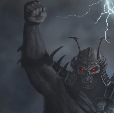
I've always imagine ermac looking just like this guy, minus the blue skin.
http://1.bp.blogspot.com/-dCnnSmjZAAA/Uv7j4CGKexI/AAAAAAAAAvc/mJgKoj6lEfY/s1600/Warpdarkmatter.png

About Me
 THANKS MINION!!! You're freakin LEGIT
0
Honestly, the Fatality graphic are really freakin bothering me. For example, Ferra/torr; when they perform their fatality, an the body is spit in Half, (Kung Lao's having the same problem as well) You can see this This black outline around the body. it bothers the hell out of me. And cassie's neck. other than that, everything seems great.


About Me
"BEER ME!" - Noob Saibot
0
charlesadamst Wrote:
He looks at kano like this too, who is his height.
Sub-Zero looks like that because he's looking up to Ermac since now he floats....which is something NRS should have never done to a character to begin with....
He looks at kano like this too, who is his height.
Can you supply source to this?
About Me
_________________________
No Cage? No sale!
0
jimmykricket Wrote:
! Quote>
I lol'd.
Ermac... He's evolved. Like a Pokemon...
! Quote>
I lol'd.
About Me
 Props to MINION
0
Kotal kahn's nose piercings that look like hard nose hairs


© 1998-2024 Shadow Knight Media, LLC. All rights reserved. Mortal Kombat, the dragon logo and all character names are trademarks and copyright of Warner Bros. Entertainment Inc.