
AHAHAHAHA!!!!!! Great work man! Delightfully creepy sadly Im on my PS3 and cant apply it right now. Wow though 12/10
Dude, I started to take your braces off! Lol! But they matched the color scheme of the sig so I left them on. Haha!
I'm so happy you like that one. I think it was the most challenging one so far. I'm usually not that great with images of actual "people".
Anyway, yea...wonderful then.
:
:
:
1.- I don’t like the huge blue thing that covers Sonya, that’s why I (constantly, lol) specified that I didn’t want anything that blurred the images or covered them. I’d like her to be complete. Her entire arm should be shown please.
I can do this (actually, I started to...but it could be a matter of taste.) BUT be warned, IF I do this, the sig will look more incomplete.
2.- One picture makes me feel the sig is too empty and that something is lacking. Could you please use the render in something similar to this (if you say it looked too small)?:
Sonya example
Looks pretty cool. You can have that one in the right side of the sig or something (though her sexy golden hair bangs must be very visible).
Two things:
a.) Referring to the "too empty" thing, there are "rules",if you will, concerning the correct usage of space. "Principals", as they're referred to as. One focal image let's the sig breathe, and compliment that focal image. That is why one image "feels right" to most graphics creators, and it is because of this reason that it is correctly so.
After a graphic artist gets comfortable (with his/her "style"), and realizes that less is more, usually you see their result cleaned up a alot more. For instance, here's two of my first sigs from a couple years ago:

Or this one that's still being used around the forums:

You're essentially asking for these. At least 1 vs pose, and 1 render. "Not gonna look good."
As opposed to something you can keep for a while without it getting on your nerves, aheh:

See? Easier on the eyes than the previous two.
b.) Second thing here is, that "official" Sonya render does not compliment the vs pose render. Almost never will. No matter how it's positioned in the sig, what angle, what effect.....just about never works out (as shown above). But, here's another sig where I tried the same thing:
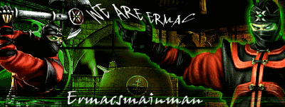
= Image quality got better.
= Flawed, Cluttered technique.
Still looks cool though. I got lucky the guy liked that one and wore it for a while.
3.- The background is stunning, but like you said, its not really magical. You don’t have to change it! But you could add some sort of special effects on the back that make it seem magical such as some form of “magical mist/dust” “glowing stars/sparkles”, etc. You know, something more supernatural and shiny. That’s the word I guess.
This could happen. But note, in the link to my other thread that I posted above...."special effects" are not exactly a part of my arsenal yet without some sort of tutorial, or vice (the Raiden arts "lightning effects" are where I'm pretty much at as far as effects). "It's not my style right now, although I could emulate it." Take alot more time for me to figure out and get to look good.
Emulation is the same as plagiarism in my book. So, I don't do it unless I can implement my style about it to an in-disputable degree. And then it has to at least look good.
For your sig, it didn't work within my style, so I left it out.
Yea, I had "lightbulbs" and all that in there (kinda like in Vash_15 sig I just posted up), but it turned out f'ed up. haha!
iMo, the rule is, "don't show almost good, show great".
Dig?
4.- The size leght is excellent, but it would be nice if it was a bit taller, that way, the Sonya you used in your sig would fit more inside the pic, that way, that cutted portion of her stomach/belly will be seen, just like it can be seen in the cutted pic (and it will help the render Sonya as well).
This one is a stout, "No".
And all you'd need to prove it to you, is to put this sig, in your sig space: "Click to see the whole image". Which is actually, exactly my point about the size of an image....

It is taller, and longer than the parameters that I make signatures for this site.
It will not only violate the kilobyte limit (kb limit) of 120kbs per user, but as you can see, the space that is allowed in your sig space, will not allow it to exist as a full image. "It will cut off at some points".
Now, within a post on the boards, the max width of any image is always 400. Then it doesn't matter how tall the image is. But in your sig space, height does matter. It cuts off after a certain extent....um..
Try these in your settings menu, put the HTML all together, and hit the "Preview Button" to see what I'm talking about:
1. width - 410x160 - height 115.26kb

2. width - 420x170 - height 118.01kb
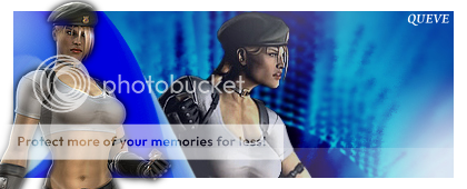
3. width - 450x200 - height ~extreme scenario 1, bump width & height~
126.65kb
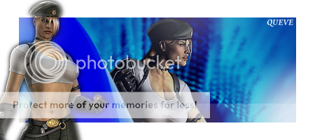
4. width - 400x200 - height ~extreme scenario 2, only bump height~ 124.55kb

Note: The size I like to use is width - 400x150 - height.
Note:, that all of those are PNG files, the only file type that lets me maintain the image quality like that, and allows "official render" Sonya, to be transparent outside of the previously constructed graphic.
Note:, that all the file sizes are near the file-size-limit of this sites permitted 120kb per user.
Note: Look at your name within the sig, and the border, disappear...."official" Sonya renders hat-shadow limit. *there's an "end" to the top of her berret, if you can see that.*
Note: This:
Cost you 16.41kb. Which, as I'm sure you know, adds in to the cost of whatever sig that you are wearing. Avatars kbs + Sig space images kbs, has to = less than 120kbs for this site. All sigs, userbars, banners...whatever. Text, and links in the sig space are exempt, I think. Cuz there's no image associated with those..
All of these things matter when I'm trying to get you a complete sig that looks good....that doesn't violate the rules of this site...ect
So simply put? Wear the size I suggest you wear when I make you a sig and avatar, because all of this stuff is considered already according to the rules of this site when I make you a graphic....
I do it like that because I've had people get shadow banned for things that I made them in the past couple years here. I already tried what you're asking for more than a few times, basically.
That’s it Pred. I hope that’s good.
BTW, if you don’t mind, I’d like to use my new icon pic when I finally get the sig. You see, I want to make the change of both things at the same time.
For some reason, I feel that would be great and feel "official" for me.
All good with me... I like to do the same thing every once in a while.
==============------------------================
Final word:
Essentially, you're gonna need to do what I had to do in the beginning. And that is, lower your expectations for the kinds of sigs that are definitely possible, and limit that expectation to "who" you see making the kind of graphic that you want to wear. Then...make sure to ask them to make you what you like....because they already produce it. See what I'm saying here? "What you like from them, is their "style" by artistic nature.
Alot of this stuff is based on the persons style, and what their artistic imagination guides them to make of the idea that you had.
So, most of the time you will not get what you asked for, BUT if you ask the right person, you will almost always get something really good.
Also depends on how perceptive the graphic artist is. Like this sig I got from MINION.

Gave me exactly what I liked because he was able to kinda, "zero in" on my taste; and what I was also trying to accomplish through what I was making at the time myself. He hit it right on the head. Therefor, it's very safe to say that he's definitely "better than me" at graphic arts...still. *mumbles a little* lol.
So dude, you gotta lower your standard a bit to appreciate what's made for you.
3-5hrs on you is enough, and the changes you're asking for will make the sig look worse....(okay, okay.."iMo")
Trust me.

Take or leave...
151

Thanks Thepredator151, Me, And vash for the sigs!!!
I love mk!!! I have almost every game and love fighting. I mean not killing people but, fighting. Join Vash_15's MKO Mugen project
151
You misunderstood the long sig I gave you as an example.
Anyway, I'm aware the time you spent on the sig is a lot and that you did your best, for that Im very grateful, and like I said, its a pretty sig, but Im not satisfied with it because it lacks many of the main things I had hoped for. Im totally in LOVE with the icon which is perfect, so yes, I'll be keeping both (even the sig if that’s OK with you), many thanks.
I will, however, try to get a signature that captures the essence of my idea more deeply. I do hope that this doesn’t bother you, since you've said you like to get sincere feedback and all, but I trust it doesn’t because you seem very professional about it. Your sig is good, I'll use it because I do think its pretty and because you worked hard on it, and i value that, but I'll also try to get another one thats more like what I wanted in my final post.
Once again, many many thanks Pred! And trust me, the pm is on its way! I’ve just got to get some things sorted first before I write to my buddies.
Hugs,
queve


Thanks to pred151 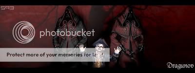
Shazeem1
Signature: 15.21kb
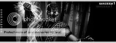
Turned out great after I simplified things. Enjoy!
List
1. mkdfan - (already got a new one)
2. The_Doctor ([??] I'm gonna wait on your reply. You'll be skipped until you answer. [??])
3. GrotesquetheBeast
4. Cyrax1020
5. shazeem1
6. scorpionjdr93
7. queve
Still a little early for me so, I'll try those last ones before I call it quits tonight.
EDIT Extra, since he's not using it, Someone else can claim this modified version. Whoeve says they want it first, gets their name in it.
Signature: 63.4kb
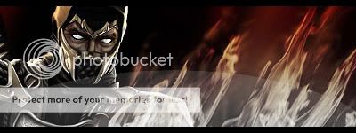
Whoever calls it first gets it!
EDIT
scorpionjdr93, dude, you gotta pick one character. lol! Might just be me but, what's coming of the two of them together in the sig is just....."plzzzzz"
lol
I'm working on a Smoke only sig right now...so stop me if you wanted Noob instead or something.
That is okay if you dont mind me changing it entirely ?
http://ui05.gamespot.com/1700/ramonsalazarverdugos_2.jpg
Something like a red and black background with the words Dragunov on it?


You misunderstood the long sig I gave you as an example.
b.) Second thing here is, that "official" Sonya render does not compliment the vs pose render. Almost never will. No matter how it's positioned in the sig, what angle, what effect.....just about never works out....
I addressed this in a different portion of my reply. Let me explain.
That "official" Sonya is a much taller picture than the "vs pose" render is. So, to shrink it enough to give you what you asked for, damages the render too much, and disrupts the composition of the picture. Like a dam in a river the whole thing doesn't flow well with the other thing being there. So, I tried it, but ultimately just hit "Delete" on it.
Anyway, I'm aware the time you spent on the sig is a lot and that you did your best, for that Im very grateful, and like I said, its a pretty sig, but Im not satisfied with it because it lacks many of the main things I had hoped for. Im totally in LOVE with the icon which is perfect, so yes, I'll be keeping both (even the sig if that’s OK with you), many thanks.
I'm cool with that. It also doesn't seem like you're ungrateful or anything. You more seem like me during my first couple of request in the old request thread..
1st Request is on this page. Note BOMBSnFISTs reply to my long request. HA! Mirror.
Then Note the ACTUAL sig I got, that is a collaborative effort from BOMBSnFISTS & DragoNEn3rgY:

Awesome sig, but it is nowhere near what I asked for at the time. Nowhere near even the dumbed down version of the idea. heh..
2nd Request on the next page Look at all those pictures! Haha! Spans over the next three or so pages in there. LoL, I was such a n00blet.
All I'm saying is that this request from you, looks alot like (almost identical) to the way I was requesting and having to "dumb-down" my idea for the sig that I wanted. hahaha....I remember that so well, and it's almost perfect irony that I'm the guy replying as they replied to me, to you now over a very similar request. lol
I will, however, try to get a signature that captures the essence of my idea more deeply. I do hope that this doesn’t bother you, since you've said you like to get sincere feedback and all, but I trust it doesn’t because you seem very professional about it. Your sig is good, I'll use it because I do think its pretty and because you worked hard on it, and i value that, but I'll also try to get another one thats more like what I wanted in my final post.
Oh naw, doesn't bother me like that. My reaction is more like....I just don't make you anything until you come around. Now, understand that It's "natural"(couldn't think of a better word than "natural") for that to happen, and I've been through more than a few users like that to understand that process. It's just "disappointment" happening. And it is as a result of higher expectations, and a rightfully sought after....seemingly, feasible idea from your perspective.
You've probably been exposed to better than what I can currently produce. And even more likely, you've probably become accustom to a different style than I provide.
It's alright cuz it needs to happen like that.
--
Other thing, I'm a harsh critic sometimes, so I kinda expect people to do the same thing to anything that I make. Makes me better eventually. So I don't mind if you tell me what you don't like.
Too, at the end of the day, you at least have something undeniably good to wear for now.
That is okay if you dont mind me changing it entirely ?
http://ui05.gamespot.com/1700/ramonsalazarverdugos_2.jpg
Something like a red and black background with the words Dragunov on it?
Nope, don't mind at all....
Signature: 65.28kb
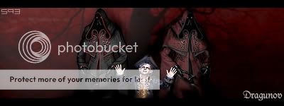
mwahahaha! I love that color scheme, but never seem to make anything like that for myself. Ah well, eventually I will find an excuse to have the same color scheme. Til then, Hope this is what you like for a while.
I almost didn't do this sig because it had the three characters in it. But, I was juuuust able to make them small enough to fit logically into the thing.
Later!


Thanks to pred151 
i was gonna tell you to add my initials but i forgot and you did it anyways thanks dude!!! haha it looks perfect EDIT: i hope you dont mind but i saved the pic to my computer just in case you deleted it off of your photobucket but i gave you all credit still EDIT2:i noticed the widescreen type effect that is also more badass seriously 10/1 for this sig!


Wow that is awesome!
i was gonna tell you to add my initials but i forgot and you did it anyways thanks dude!!! haha it looks perfect
EDIT: i hope you dont mind but i saved the pic to my computer just in case you deleted it off of your photobucket but i gave you all credit still
EDIT2:i noticed the widescreen type effect that is also more badass seriously 10/1 for this sig!
Didn't get finished with it soon enough but, here:
Avatar: 28.74kb

Looks like I was uploading this while you were posting.
Aaaaand I'm done for a while now.
See everyone next time!
SickFreak!!
What up buddy? Haven't seen you in a long time man...
Anyway, I tried that thing just now (bout 5-10min) All I did was clean it up a little bit:
Team Sig: 75.61kb Don't know if file size is an issue. Still pretty low as a PNG for a picture that big though.

It looks good, we used it as our team logo for a few days, but our team leader changed me and a few other peoples grades to Captain, and that basically means we can't mess with the team profile.
My tastes have changed since I created this account over 4 years ago. I prefer being called Siklootd and now love heavy metal music. 

Question: How big do you generally make the sigs and avatar?
Sigs are generally no larger than 400 by 150 pixels but they could be made slightly taller than 150 pixels, not too much bigger however or they won't fit in the small area designated for signatures.
Avatars are no bigger than 75 by 75 pixels. You could go bigger, but then the avy will appear "squashed" since it will be too large for the 75 by 75 box that MKO gives its users.

http://i34.tinypic.com/10pr0ug.jpg
i would like it to say "classic" some where on it as well ^^ just want it to look "elegant/deep/mysterious" overall :)
thank you.


Picture
And have my name somewhere on it please. You can shorten it to SA. Thanks.
I would like to have the Shang Tsung render from MK vs. DC (http://www.mortalkombatonline.com/perl/cds.cgi?external_action=displayImage&id;=1922). I would also like JRC15 to appear somewhere in both the signature and avatar.
Other than that I'm not too picky. Whoever picks this up can do whatever with backgrounds, and the way JRC15 is implemented. A big thank you in advanced.


Why don't you have a seat?
Could someone make me a sig and matching avy with this picture please:
Picture
And have my name somewhere on it please. You can shorten it to SA. Thanks.
Ask and you shall receive.
AVATAR:

SIGNATURE:

I hope you like it.
Here:
Avatar:

Sig:

Enjoy.
Please forgive me if this is the wrong forum but i'd like to request a MK vs DC sig. I want it to be like this.
2 MK characters on each side which are Shang Tsung and Sub-zero and 2 DC characters on other side who are Batman and Joker.
And also could you make it bloody.
Could you make ir 400 x 150.
If you could make it i would be very grateful THANKS!
If you need the cut outs go here.
http://forums.midway.com/mortal_kombat_vs_dc_universe/b10806/28913739/p1

Thanks Thepredator151, Me, And vash for the sigs!!!
I love mk!!! I have almost every game and love fighting. I mean not killing people but, fighting. Join Vash_15's MKO Mugen project
I'd like to request a signature description is below.
Please forgive me if this is the wrong forum but i'd like to request a MK vs DC sig. I want it to be like this.
2 MK characters on each side which are Shang Tsung and Sub-zero and 2 DC characters on other side who are Batman and Joker.
And also could you make it bloody.
Could you make ir 400 x 150.
If you could make it i would be very grateful THANKS!
If you need the cut outs go here.
http://forums.midway.com/mortal_kombat_vs_dc_universe/b10806/28913739/p1

Thanks Thepredator151, Me, And vash for the sigs!!!
I love mk!!! I have almost every game and love fighting. I mean not killing people but, fighting. Join Vash_15's MKO Mugen project
 Hope you like it!
Thanks Thepredator151, Me, And vash for the sigs!!!
I love mk!!! I have almost every game and love fighting. I mean not killing people but, fighting. Join Vash_15's MKO Mugen project
My tastes have changed since I created this account over 4 years ago. I prefer being called Siklootd and now love heavy metal music. 

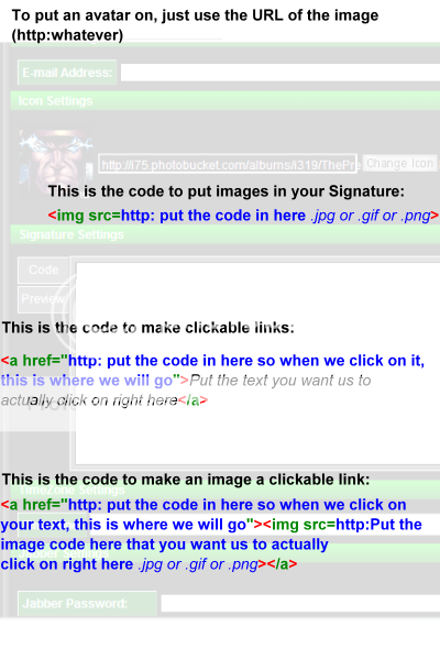
p.s. vexta to make the signature appear put,
Put a space between the g and s in, (imgsrc) and put a > at the end of the here.
Just copy and paste the following code to make it show up as a signature:

Thanks Thepredator151, Me, And vash for the sigs!!!
I love mk!!! I have almost every game and love fighting. I mean not killing people but, fighting. Join Vash_15's MKO Mugen project
p.s. vexta to make the signature appear put,
Put a space between the g and s in, (imgsrc) and put a > at the end of the here.
Just copy and paste the following code to make it show up as a signature:

This is Thepredator151's chart to help with that kind of things. NOTE: This is not mine in anyway, shape or form. Just posting it for more people to see.

Thanks Thepredator151, Me, And vash for the sigs!!!
I love mk!!! I have almost every game and love fighting. I mean not killing people but, fighting. Join Vash_15's MKO Mugen project


