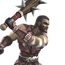
Demitri Terrakai - Avatar for the fallen Earth God
Fan Kreations
Pages: 1
Demitri Terrakai - Avatar for the fallen Earth God
| Artist's Remarks: | |
|
School project that I was talking about. Thought I'd give Kai a makeover and new purpose in one picture. Oh yea, this is a photo manipulation of myself. More info later... Enjoy!
|
| Full Scale | 550x518 | Category | Drawings (Digitally coloured) | User Views | |
| User Likes | User Ratings | 4 | Score |
|
0

0
Afro=Kickassitude, man.
Looks like an interesting concept.
Looks like an interesting concept.


0
Bigger Version
Original Image
So yea, the character himself was heavily manip'ed. Painted alot, there's only a few things I sampled (which I think by looking at it, you can tell are the hair, the pants, and the chest//stomach muscles). Slacked off a bit on the bg to meet the deadline.
If they'll let me, I'll probably use this image for ~Crow~ and Pink_Ranger's character contest.
Questions?
0
It looks quite good, though there are a few things I'd like to point out...
First, his tattooes, the white marks look flat. They don't seem to follow his body and muscles naturally, there are no natural curves in them which makes them look a bit off.
Second, the sand comeing from his hand looks very pixelated. Maybe blur them out a bit so you won't notice the hard edges. The same goes for his "wounds" on his body.
With that said, I'd like to say that I love wha you've done with his body, making the lines look rough like that, especially seen on his right arm and his face. It makes him look like he is made of stone which is a very nice touch.
The afro, however, is not something I am a big fan of, as the rest of his body looked like carved stone. It just looks too fluffy, but it's just my personal opinion.
The background looks very awesome, definately something that could be a great stage for the next MK game!
His clothes, the pants and the cloth belt, looks very realistic! Is that also photomanipulated into the picture, or have you made that yourself?
Overall, this is a nice picture. I'd give it 4/5!
Good job!


0
Jaded-Raven Wrote:
First, his tattooes, the white marks look flat. They don't seem to follow his body and muscles naturally, there are no natural curves in them which makes them look a bit off.
First, his tattooes, the white marks look flat. They don't seem to follow his body and muscles naturally, there are no natural curves in them which makes them look a bit off.
Ah crap!; you seen that too! lol
Seriously though, there was a healthy debate between my classmates and I on adding them or not towards the end. I didn't rush on it, but I knew I didn't craft them as well as I would have liked due to time.
It was one of those things where, I happened to get far enough into it to just say "what the hell", and keep them on in the last day or so of production.
Good eye here.
Jaded-Raven Wrote:
Second, the sand comeing from his hand looks very pixelated. Maybe blur them out a bit so you won't notice the hard edges. The same goes for his "wounds" on his body.
Second, the sand comeing from his hand looks very pixelated. Maybe blur them out a bit so you won't notice the hard edges. The same goes for his "wounds" on his body.
I see this perspective too. After showing it to the class and my instructor, opinions basically split throughout the class so, I kept it as is. This issue however, or rather, these textures had alot more of my attention during the creation process.
So, even though I did blur these things this time, I'm glad you noticed it. I'll try to watch for this sort of thing in projects to come.
Jaded-Raven Wrote:
With that said, I'd like to say that I love wha you've done with his body, making the lines look rough like that, especially seen on his right arm and his face. It makes him look like he is made of stone which is a very nice touch.
With that said, I'd like to say that I love wha you've done with his body, making the lines look rough like that, especially seen on his right arm and his face. It makes him look like he is made of stone which is a very nice touch.
Yes, this was one of the first things that worked out quite nicely for me. Initially, most of his leg, and body were going the way of a "a man coming out of a stone".
When that didn't work out, the natural progression from that is what we have now. I'm very proud of this appeal so I'm really happy you noticed that. There's also alot of color at play there (as far as painting goes), and a problem that existed for a good portion of the process, was that the space that is rock-like under is arm, was hard for me to figure out how to gain a more 3-dimensionality.
The effect wasn't right for most of the process because that part of his body looked very flat at first.
Jaded-Raven Wrote:
The afro, however, is not something I am a big fan of, as the rest of his body looked like carved stone. It just looks too fluffy, but it's just my personal opinion.
The afro, however, is not something I am a big fan of, as the rest of his body looked like carved stone. It just looks too fluffy, but it's just my personal opinion.
Haha! I anticipated at least some draw-back from the "Sho-Nuff" fro.
The concept however, was an inquisitive one. One that asked: "I wonder what Kai would look like if he took his braids out from MKA?".

Hair is hard enough to deal with, but from personal experience (very old image), it wasn't too hard to figure out.
I'm not sure I was going for a more stone look throughout the characters design. But, I do know how an afro should look and behave. That's an interesting concept you have though.
Btw, his hair was a b*tch to deal with at first. lol! Had to use almost everything I know about cutouts, and preserving image quality to get the hair to look like it does. I love the hair, but I'm biased because of the labor I put into it, and because the end result we see here is extremely rare as far as how well done I know it is.
Room to improve is there of course, but the technology presents a fight that I don't commonly see people go through to get that kind of result.
Jaded-Raven Wrote:
The background looks very awesome, definately something that could be a great stage for the next MK game!
The background looks very awesome, definately something that could be a great stage for the next MK game!
Thank you. I didn't spend much time on this area in particular because of time restraints. I did this portion of the image the night before I turned it in. Environmental stuff isn't really my forte' at all.
Jaded-Raven Wrote:
His clothes, the pants and the cloth belt, looks very realistic! Is that also photomanipulated into the picture, or have you made that yourself?
His clothes, the pants and the cloth belt, looks very realistic! Is that also photomanipulated into the picture, or have you made that yourself?
Both.
Initially, the belt was a cutout. However I went in and manipulated it alot(oh god). Painting, and used alot of masks and so on. Same for the pants.
In the very beginning though, they both started off as very undefined paintings of what I wanted. The cuts I used helped define things.
So, the top of the waist belt is painted, but the bottom (hanging) takes on more characteristics of the cutout. And the pants, alot of those seams and so on, I created from scratch to establish depth and leg separation. Alot of his pants didn't exist, even with the cut out.
--
Thanks for the Crit! I really do appreciate it.
Pages: 1
© 1998-2025 Shadow Knight Media, LLC. All rights reserved. Mortal Kombat, the dragon logo and all character names are trademarks and copyright of Warner Bros. Entertainment Inc.


