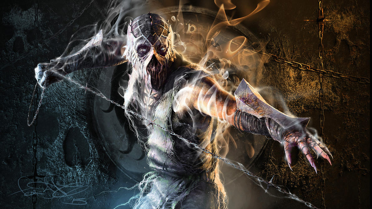
onaga
Fan Kreations
Pages: 1
onaga
| Artist's Remarks: | |
|
this is my design for this mortal kombat character.
|
| Full Scale | 646x901 | Category | Drawings (Digitally coloured) | User Views | |
| User Likes | User Ratings | 8 | Score |
|


About Me

0
I love it. the design in Fantastic! 5/5


0
This one is the best one out of them all. Though it does look as if you need a image editing program though. Better quality picture and I'd be willing to cut these and have them posted on the front page of the cut out thread with the other Fan Art.
Very good but it looses a couple points for image quality right off. Other stuff is kinda insignificant until that's straightened out.
Picture looks good though, don't be discouraged. 3/5
Very good but it looses a couple points for image quality right off. Other stuff is kinda insignificant until that's straightened out.
Picture looks good though, don't be discouraged. 3/5


About Me
 art by fear-sAs
0
Out of everything in the picture, what bothers me the most is his feet. The way you drew his toe nails gives off the impression that he was stabbed right through the center of each toe. If you're going to draw dragon talons, you ahve to make them look a bit like elongated diamonds which are short up top and longer at the bottom.
Also, his bone structure in the wings is wrong. From what I can remember, all the hinges in his wings came from one corner, up in the very tip of the wings. I'd suggest looking at batwings for reference. That might help.
However, the overall design, and detail works really well. It's very japanese but it looks good. Great work on the detail and actual outfit. You should start coloring these in some kind of computer program like photoshop.
3/5. Great concept but a few things bring it down.
Pages: 1
© 1998-2024 Shadow Knight Media, LLC. All rights reserved. Mortal Kombat, the dragon logo and all character names are trademarks and copyright of Warner Bros. Entertainment Inc.


