
What about the words fatality and finish him?
What about the words fatality and finish him?
0
posted06/28/2014 02:21 AM (UTC)byMember Since
03/07/2011 07:22 AM (UTC)
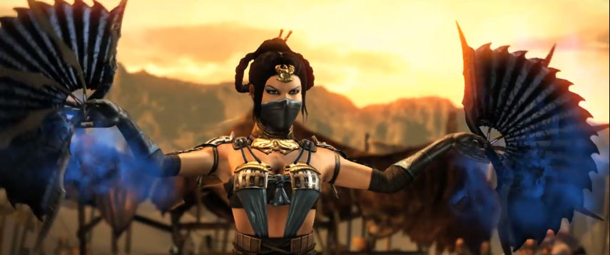
Anyone else feel they are just meh for this game. Id like to see something like how it was in MK2 where blood dripped from the bottom of fatality. I know to some its not really a big deal,I dunno or how about it says fatality and then a blade slashes it across the middle and the bottom part falls and starts to drip blood
About Me
Winter is Coming A Lanister always pays his debts You know nothing Jon Snow! We do not sow! Valar Morghulis
0
^ I agree. I could be wrong, but maybe the dripping thing wouldn't work as well here like it did in the 2D era.
0
No, it looks way better this time around.
About Me
0
I like the font in the game.
I just wish the health and super meters were a little more visible, like...in different colors instead of all white.
I just wish the health and super meters were a little more visible, like...in different colors instead of all white.
About Me
"BEER ME!" - Noob Saibot
0
I don't mind the "Finish Him" splash. It's the Fatality splash that's bothering me. I'm hoping it's a placeholder, because this is taking a step backwards compared to MK9's Fatality splash. A regular text font appears. The End.
While the Fatality font in MK9 is stylized. Again, hoping it's a placeholder.

While the Fatality font in MK9 is stylized. Again, hoping it's a placeholder.
About Me

0
I REALLY like the current UI overall. I'd like to see the Health and Stamina bars get some small adjustments, but only for the sake of readability. The current fonts and design are elegant and classy. I hope they stay as is.
Overall I think it's a nice step forward for the franchise's presentation. Glad to see progress.
Slightly unrelated, but I'd really like for the Announcer to say more in MKX. He never seemed to do much "commentating" in MK9. This is one of the things that bring the most hype in the new Killer Instinct, and I know MK could do it even better!
0
The font looks fine to me.
Off Topic...
The camera should stay on the carnage after a fatality and not pan on to the victor.
Off Topic...
The camera should stay on the carnage after a fatality and not pan on to the victor.
0
A stylized font would look greatly out of place here. It should be kept the way it is.

About Me

0
WeaponTheory Wrote:
I don't mind the "Finish Him" splash. It's the Fatality splash that's bothering me. I'm hoping it's a placeholder, because this is taking a step backwards compared to MK9's Fatality splash. A regular text font appears. The End.
While the Fatality font in MK9 is stylized. Again, hoping it's a placeholder.
^This I much prefer the stylized font of MK9, maybe we can get an updated variation or at least something very similar because MK9's version was spot on.
About Me
Sex is Evil, Evil is Sin, Sin is forgiven, so Sex is in.
I kill people for a living. Get over it.
0
I'm really not a fan of the UI I like it better when they have the characters head next to the power bar. Killer Instinct has it right IMO.
I prefer what Injustice had for the X-Ray Meter with the fighter specific image.
I prefer what Injustice had for the X-Ray Meter with the fighter specific image.
I'd put money on the meter UI changing significantly from this early build. Looking back on MK9 they revamped the meters from E3 2010 to the final game. As it is now, the meters are very blah. I don't mind the style for "Finish Him/Her"...kinda growing on me.
0
Why would a game as seemingly dark as this new MK need some goofy-ass stylized font? It doesn't fit it at all.
About Me
0
I also really like how the camera frames both the carnage and the victor after a fatality. Again, it looks very classy and elegant.
I dont really care to see character's heads in by the Healthbar. You know who your playing, and it's written there already. No need to clutter things up.
I dont really care to see character's heads in by the Healthbar. You know who your playing, and it's written there already. No need to clutter things up.
About Me
"BEER ME!" - Noob Saibot
0
CassiesPatentedNutBuster Wrote:
Why would a game as seemingly dark as this new MK need some goofy-ass stylized font? It doesn't fit it at all.
Why would a game as seemingly dark as this new MK need some goofy-ass stylized font? It doesn't fit it at all.
Why would a game as seemingly dark and creative as this new MK need a plain-as-fuck text font that anybody with Microsoft Word can type onto a picture? It doesn't fit at all.

0
I dont mind a modern take on it but this fond reminds me a bit of Injustice.
About Me

0
Tazer_Gunshot Wrote:
Off Topic...
The camera should stay on the carnage after a fatality and not pan on to the victor.
Off Topic...
The camera should stay on the carnage after a fatality and not pan on to the victor.
Watch those fatality vids a bit better. They focus on the carnage on a few of them, like the one from Ferra/Torr and Cassie Cage. D'vorahs fatality makes sense it would end its focus on her, because the skull rolls to her and she smashes it with her foot. Would be stupid to backtrack to the body after that.
I think they're doing a better with the camera this time around. Hope they don't drop the ball on that.
WeaponTheory Wrote:
Why would a game as seemingly dark and creative as this new MK need a plain-as-fuck text font that anybody with Microsoft Word can type onto a picture? It doesn't fit at all.
CassiesPatentedNutBuster Wrote:
Why would a game as seemingly dark as this new MK need some goofy-ass stylized font? It doesn't fit it at all.
Why would a game as seemingly dark as this new MK need some goofy-ass stylized font? It doesn't fit it at all.
Why would a game as seemingly dark and creative as this new MK need a plain-as-fuck text font that anybody with Microsoft Word can type onto a picture? It doesn't fit at all.
Exactly! Although this current font has grown on me a bit, it doesn't feel dark to me. At first I thought they were going for a corporate-style. "What are you trying to sell?!". As I said, it has grown a bit on me, but to call it a dark font would be a few bridges to far.
0
WeaponTheory Wrote:
Why would a game as seemingly dark and creative as this new MK need a plain-as-fuck text font that anybody with Microsoft Word can type onto a picture? It doesn't fit at all.
CassiesPatentedNutBuster Wrote:
Why would a game as seemingly dark as this new MK need some goofy-ass stylized font? It doesn't fit it at all.
Why would a game as seemingly dark as this new MK need some goofy-ass stylized font? It doesn't fit it at all.
Why would a game as seemingly dark and creative as this new MK need a plain-as-fuck text font that anybody with Microsoft Word can type onto a picture? It doesn't fit at all.
That's the thing, though, it DOES fit the game, unlike your terrible choice for a stylized font. This is not colorful MK 9, dude. This game is, literally and figuratively, DARKER than the last MK, and it should make use of a more mature font befitting of its atmosphere.


CassiesPatentedNutBuster Wrote:
That's the thing, though, it DOES fit the game, unlike your terrible choice for a stylized font. This is not colorful MK 9, dude. This game is, literally and figuratively, DARKER than the last MK, and it should make use of a more mature font befitting of its atmosphere.
WeaponTheory Wrote:
Why would a game as seemingly dark and creative as this new MK need a plain-as-fuck text font that anybody with Microsoft Word can type onto a picture? It doesn't fit at all.
CassiesPatentedNutBuster Wrote:
Why would a game as seemingly dark as this new MK need some goofy-ass stylized font? It doesn't fit it at all.
Why would a game as seemingly dark as this new MK need some goofy-ass stylized font? It doesn't fit it at all.
Why would a game as seemingly dark and creative as this new MK need a plain-as-fuck text font that anybody with Microsoft Word can type onto a picture? It doesn't fit at all.
That's the thing, though, it DOES fit the game, unlike your terrible choice for a stylized font. This is not colorful MK 9, dude. This game is, literally and figuratively, DARKER than the last MK, and it should make use of a more mature font befitting of its atmosphere.
QFepicT


I like the font they are using now. It has a more serious tone to it. Not sure if that will be the final font or anything.
Also, I love the final shots that they show from a low camera angle up at the victor. It just seems very cinematic.
Another thing I noticed in the videos as well, after a Fatality, it will say "Fatality! Cassie Cage (or whoever) wins.) This is also something that was done in one of the past games early stages (MKD I believe) so I know it is subject to change.
About Me
"BEER ME!" - Noob Saibot
0
CassiesPatentedNutBuster Wrote:
That's the thing, though, it DOES fit the game, unlike your terrible choice for a stylized font. This is not colorful MK 9, dude. This game is, literally and figuratively, DARKER than the last MK, and it should make use of a more mature font befitting of its atmosphere.
That's the thing, though, it DOES fit the game, unlike your terrible choice for a stylized font. This is not colorful MK 9, dude. This game is, literally and figuratively, DARKER than the last MK, and it should make use of a more mature font befitting of its atmosphere.
I'm sure I'm talking to a brick wall, but fuck it, I'll go for one last attempt to talking sense into you and anyone else who sadly agrees with you.
"That's the thing, though, it DOES fit the game, unlike your terrible choice for a stylized font."
No, it doesn't and I'll explain why shortly.
As for "my terrible choice"? It's already in a game! I can see you barely touched MK9 because this isn't some picture of a font I created. And I'm not saying to reuse the fucking thing, I'm simply pointing the difference between creativity done between MK9 and MKX. And to straight up say that a plain text is better than something that took time to create, is fucking crazy.
And here's why:
There is nothing creative about it at all. Every Mortal Kombat game had its own stylized fonts, while this one is the laziest one ever. I open up a Microsoft program that features fonts because I thought I was just bullshitting myself when I previously said "anybody with Microsoft Word can type onto a picture", and found the following in six seconds just randomly selecting any thing in the scroll.
- Sylfaen
Then for the hell of it, I went to search for a little more.
- Gentium Basic
- Palantino Linotype
Go compare it yourself. If you still think this lazy shit is perfect, then you are easy to amuse and entertain.
Oh and I love the following:
"This game is, literally and figuratively, DARKER than the last MK, and it should make use of a more mature font befitting of its atmosphere"
Yeah, let's slap Times New Roman font and call it a day, shows how fucking serious we are!
No, seriously, even Times New Roman also almost borderlines the resemblance. Whoever is going to rip text out of MKX for the Warehouse, it's going to take no effort whatsoever when already existing fonts are available. Hate on the MK9 Fatality Splash all you want, I really don't care, I'm simply saying they could had put effort on that Fatality part in this game and not cheapen the fuck out of it.
Oh and calling MK9 colorful? Exaggerate much? Especially what everyone is bragging about this game's visuals is the same thing people said about MK9's development. You're talking like MKX is a HUGE step. Just stop kidding yourself. It's just a slight update to the same engine used in "Injustice", which people said that game visually looks "darker" than MK9. You're acting like they're using Unreal Engine 4 for this game. I know this game has "advance" tech to pull off some new creative fatalities, but again, you're exaggerating the whole "omg it's Darker!!!".


© 1998-2026 Shadow Knight Media, LLC. All rights reserved. Mortal Kombat, the dragon logo and all character names are trademarks and copyright of Warner Bros. Entertainment Inc.