
The use of color in the next game...
Mortal Kombat X
Pages: 1
The use of color in the next game...
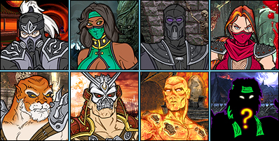
MK vs DC used a lot of bright colors in the game, which is completely understandable with the usage of the comic book heroes and such, but MK has always used a lot of bright colors in their games and I kinda feel that it's a tad bit too much brightness in the game... I mean with the girls, you have Pink, Light Blue, Jade and Yellow. They're really bright colors.
You think they should dim things up a bit and make it a bit darker? Or just keep it where it's at? Just something that caught my attention.
You think they should dim things up a bit and make it a bit darker? Or just keep it where it's at? Just something that caught my attention.

About Me
0
It depends.
On one hand, dulling down the color palette tends to make games look ugly and boring. There's such a thing as too much realism. Just look at Final Fantasy 12. And having a comic book aesthetic has always been part of MK's spirit from the very beginning, and should be respected and stayed true to.
On the other hand, Jax in purple spandex pants never made any goddamn sense. So I guess it depends on the character, bright colors fit some of them, dressing real-world and utilitarian fits others. You can't go all-or-nothing, MK's cast is too diverse for that.
RazorsEdge701 Wrote:
It depends.
On one hand, dulling down the color palette tends to make games look ugly and boring. There's such a thing as too much realism. Just look at Final Fantasy 12. And having a comic book aesthetic has always been part of MK's spirit from the very beginning, and should be respected and stayed true to.
On the other hand, Jax in purple spandex pants never made any goddamn sense. So I guess it depends on the character, bright colors fit some of them, dressing real-world and utilitarian fits others. You can't go all-or-nothing, MK's cast is too diverse for that.
This make sense, I can see what you mean if they decided to dull down the colors. I mean, Sonya has been getting more dull with her wardrobe since Deadly Alliance... that makes sense... Characters like Scorpion and Sub-Zero, they're bright, but... I don't know, just it seemed in MK vs DC they were extremely bright but I guess it was just because maybe the creators wanted to have sort of a cartoon-like feeling for the game?
cotyh09 Wrote:
yeah but where did u get pink from?
yeah but where did u get pink from?
Mileena. She's either pink or purple depending on what game you play.


0
maybe they should make their original costumes the alternates and maybe go with a darker style of costumes for this one...


0
DemolitionMann7 Wrote:
maybe they should make their original costumes the alternates and maybe go with a darker style of costumes for this one...
maybe they should make their original costumes the alternates and maybe go with a darker style of costumes for this one...
Better character designs could justify the color pallets. Taking cues from different time periods, different cultures, ect.
Main thing with the colors though, is that it should make sense thematically. Characters that are from Earth, should probably look different than characters from Edenia or Outworld for example. They do this pretty well already, but again, the better branding and character designs the better sense the game will make.
There's also sub-themes too. Like the SF from Earth, as opposed to Shao Kahns assassins. Those two would not only have the worldy different theme, but also, different themes as far as their factions branding.
So yea, color is important, but design is just as equal.
0
Well I don't want a game that's all grey and black.
Yes they should keep the same colors for the costumes. However the LIGHTING for the arenas should be dimmer/less colorful.
MKD had lots of variety in terms of lighting. Quan Chi's Lair was the brightest arena, for example, while the Slaughterhouse and the Sky Temple were nice and dark.
So imo, it's the lighting that strikes the mood, not the actual colors. I mean what kind of MK game isn't gonna have pink, green, and yellow? There goes Mileena, Jade, Reptile, and Scorpion.

About Me
0
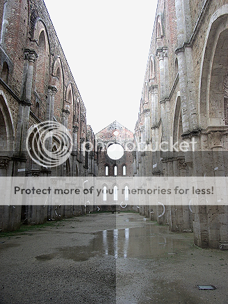
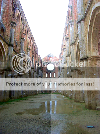
Along with agreeing with The Predator151...brightness and contrasts in general have a big part in aspects of color as well. The lushness or dullness of colors should depend on the detail,situation,costumes,backgrounds and also the definition of quality that the image(s) are/is in. I have made up an example of and image...the original is shown and than two copies of the image are cut in 4 ways with different brightness and contrasts...also one of the copies have more lush color and the other is dulled a bit to show the differences that it makes. See below...if images are too large just respectably view them in photobucket.com
first here is the original before me even touching it....

This is the dulled 4way contrast & brightness example....
Ande the lush and more colorful 4way contrast & brightness example....
first here is the original before me even touching it....

This is the dulled 4way contrast & brightness example....

Ande the lush and more colorful 4way contrast & brightness example....

Pages: 1


© 1998-2026 Shadow Knight Media, LLC. All rights reserved. Mortal Kombat, the dragon logo and all character names are trademarks and copyright of Warner Bros. Entertainment Inc.