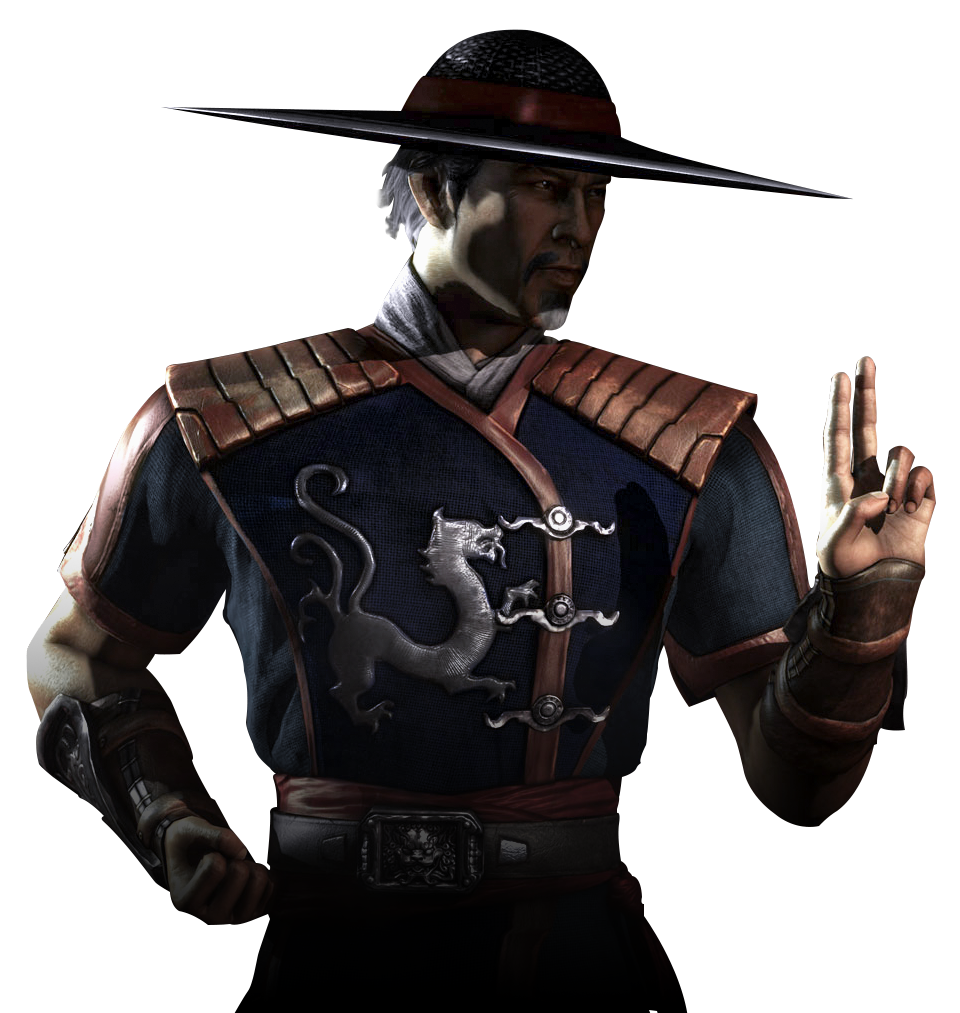
MK8 needs character concepts like this... (sketch inside)
Mortal Kombat X
Pages: 1
MK8 needs character concepts like this... (sketch inside)
0
posted10/06/2007 11:38 PM (UTC)by

I was just messing around with google and found this badass character concept, and the first thing that I thought was, THIS is what MK needs for the future.


0
Chrome Wrote:
It reeks of Made In / By Japan but the visual execution is good. Designwise, questionable but alot better than MK3-4.
It reeks of Made In / By Japan but the visual execution is good. Designwise, questionable but alot better than MK3-4.
MK3-4 were good games for its time.

0
Hm...Looks better for an SC guy.
outworld222 Wrote:
MK3-4 were good games for its time.
Chrome Wrote:
It reeks of Made In / By Japan but the visual execution is good. Designwise, questionable but alot better than MK3-4.
It reeks of Made In / By Japan but the visual execution is good. Designwise, questionable but alot better than MK3-4.
MK3-4 were good games for its time.
MK4 was outdated when it came out. The onlz good that system did was speed and dznamic lighting.
0
Chrome Wrote:
MK4 was outdated when it came out. The onlz good that system did was speed and dznamic lighting.
outworld222 Wrote:
MK3-4 were good games for its time.
Chrome Wrote:
It reeks of Made In / By Japan but the visual execution is good. Designwise, questionable but alot better than MK3-4.
It reeks of Made In / By Japan but the visual execution is good. Designwise, questionable but alot better than MK3-4.
MK3-4 were good games for its time.
MK4 was outdated when it came out. The onlz good that system did was speed and dznamic lighting.
Indeed.

0
Looks interesting

0
When I read the title of this thread I said, "I bet it's going to suck, and be horribly overdone."
I was wrong on the 1st count. It doesn't suck. It is a nice piece of art.
It is however, horribly overdone.
I always see people post art like this on forums (not just for thsi game, but several others) saying, "This is what the characters/armor should look like in the next game!" and while sometimes it's a fine piece of art... it's always way too elaborate, and wouldn't work well in a video-game setting.
Less is more people. A character doesn't have to be the ultimate visual badass to be popular.
Look at...
Kratos. Guy basically just has some tattoos, swords, and a loincloth.
Lara Croft. Tube-top, daisy-dukes, and a pair of guns.
Master Chief. Very basic green body armor, a fancy helmet, and a gun.
The Mario brothers. Blue overalls, a hat, and a pimp mustache.
Sonic the Hedgehog. A Pair of Red Sneakers.
Characters don't need to be wearing 2000 pound armor, wielding a huge non-functional weapon, have 100 spikes shooting out every which way, and have glowing eyes and their heads on fire to be cool.
Less is more.
Pages: 1
© 1998-2024 Shadow Knight Media, LLC. All rights reserved. Mortal Kombat, the dragon logo and all character names are trademarks and copyright of Warner Bros. Entertainment Inc.


