
Announcer, Fonts, Lifebars, EX & X-Ray meter, over all order of things (regarding last MKX stream build)
Mortal Kombat X
Pages: 1
Announcer, Fonts, Lifebars, EX & X-Ray meter, over all order of things (regarding last MKX stream build)
0
posted02/03/2015 04:26 PM (UTC)by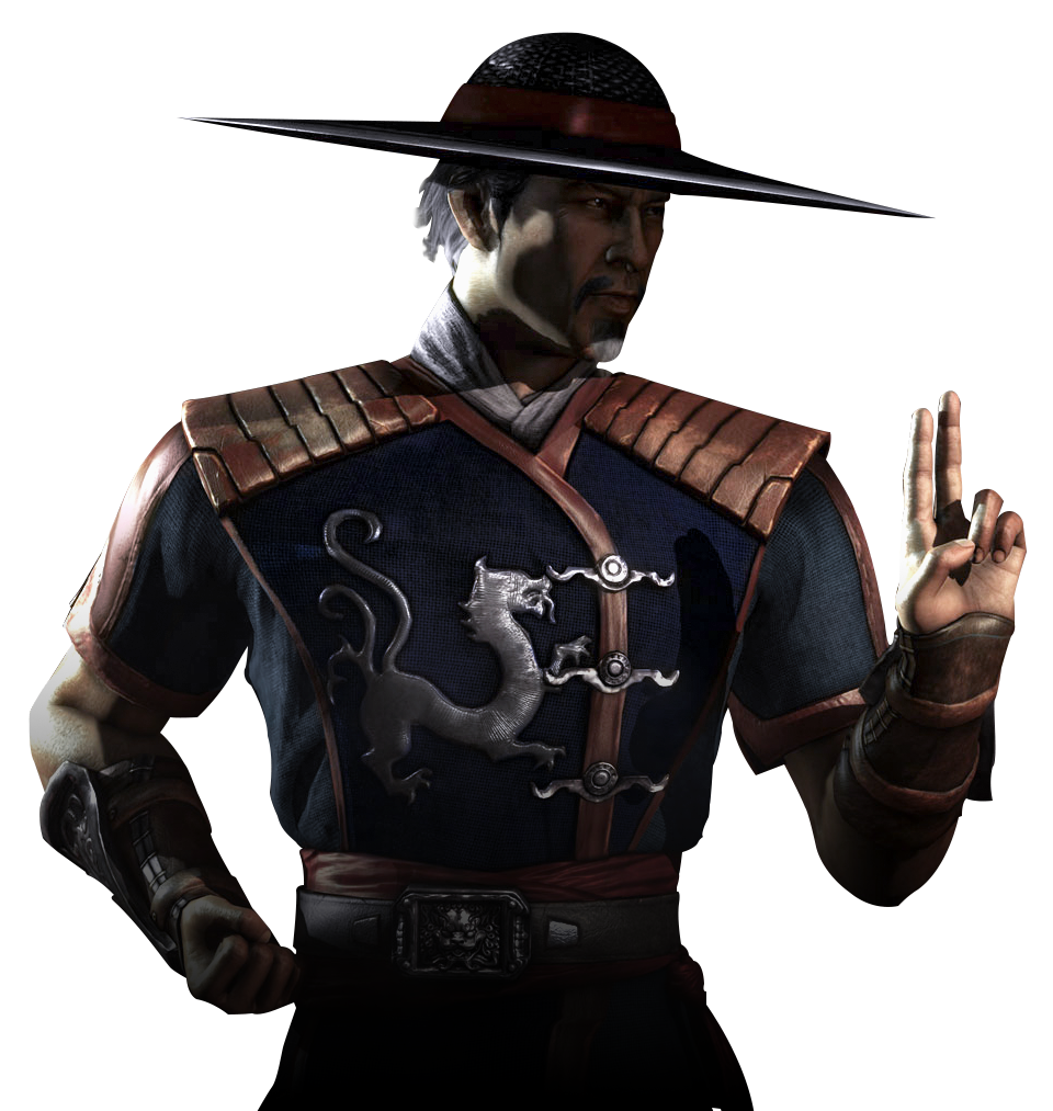
I'd like to discuss the importance of these graphics features here and hopefully they will be addressed.
The announcer does not say "FIGHT!" after the first round is finished. When it says Round 2 or Final Round, the match just sort of starts. I was hoping they'd fix this issue, and yes I know they said in the twitch stream that nothing is finalized yet, but hopefully they will change this. MK is not Killer Instinct or Injustice(and boy do I love those games).
Please keep it the traditional way where the announcer always says FIGHT after every round.

I was very happy to see that they fixed the order of which the announcer says the name of the character who wins, and then FATALITY. In every MKX build before this version, he'd say Fatality first.
If you noticed, the word FATALITY was also a bigger and bolder font than the previous ones in the current build. I like it. Then the white bar above the word and under the characters name has also been upgraded, looks better IMO.
New FATALITY font:

Old FATALITY font:

Up next, the winning round indicator icon under the stamina bar.
Winning icon indicator:

Currently, it looks like you get half a circle for each round, and a full circle for winning 2 rounds. The shape resembles the amulet, circle outside with a small square hole in the middle. What do you guys think, should it stay the way it is or should it be changed? I believe in the past they used skulls. I could go either way I guess, this stuff doesn't bother me too much.
The Lifebars, stamina, EX or X-ray meters all look great! I'm glad this will not be changed, everything looks perfect there. The white transparent color is a nice change of the old green meters. I think it goes well with the overall direction of the game.
There are only 2.5 months left before the game is out, and now is the time to address and correct these issues. I remember during Deadly Alliances build up to the release, a lot of these issues were there too, if anyone else remembers, were fixed in the release version of the game.
I'd like to know your opinions on these matters, as it is important for me personally to help make this game the best it can possibly become, because as it stands, MKX is going to be the best Mortal Kombat game ever released, and possibly for a long time in years to come.
The announcer does not say "FIGHT!" after the first round is finished. When it says Round 2 or Final Round, the match just sort of starts. I was hoping they'd fix this issue, and yes I know they said in the twitch stream that nothing is finalized yet, but hopefully they will change this. MK is not Killer Instinct or Injustice(and boy do I love those games).
Please keep it the traditional way where the announcer always says FIGHT after every round.
I was very happy to see that they fixed the order of which the announcer says the name of the character who wins, and then FATALITY. In every MKX build before this version, he'd say Fatality first.
If you noticed, the word FATALITY was also a bigger and bolder font than the previous ones in the current build. I like it. Then the white bar above the word and under the characters name has also been upgraded, looks better IMO.
New FATALITY font:
Old FATALITY font:
Up next, the winning round indicator icon under the stamina bar.
Winning icon indicator:
Currently, it looks like you get half a circle for each round, and a full circle for winning 2 rounds. The shape resembles the amulet, circle outside with a small square hole in the middle. What do you guys think, should it stay the way it is or should it be changed? I believe in the past they used skulls. I could go either way I guess, this stuff doesn't bother me too much.
The Lifebars, stamina, EX or X-ray meters all look great! I'm glad this will not be changed, everything looks perfect there. The white transparent color is a nice change of the old green meters. I think it goes well with the overall direction of the game.
There are only 2.5 months left before the game is out, and now is the time to address and correct these issues. I remember during Deadly Alliances build up to the release, a lot of these issues were there too, if anyone else remembers, were fixed in the release version of the game.
I'd like to know your opinions on these matters, as it is important for me personally to help make this game the best it can possibly become, because as it stands, MKX is going to be the best Mortal Kombat game ever released, and possibly for a long time in years to come.
0
"Fight"
We just get to see the demo version that was played and it didn't necessarily need it. I'm positive the announcer will say it in the final product when we get it. He says it before the round(s) start, not after.
I'd go with the initial font from earlier builds. The slimmer font is better.
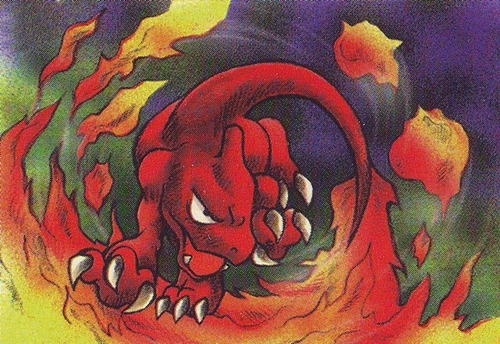
As for the round win indicator, I find it dull. I would rather have the dragon medallion instead, like in earlier games.
We just get to see the demo version that was played and it didn't necessarily need it. I'm positive the announcer will say it in the final product when we get it. He says it before the round(s) start, not after.
I'd go with the initial font from earlier builds. The slimmer font is better.
As for the round win indicator, I find it dull. I would rather have the dragon medallion instead, like in earlier games.
About Me
I will rock you.
0
I noticed a lot of bugs in the working print they showed us on the stream. Like the bar going down almost on zero then becoming full again. And like you posted it the Fatality logo is darker on some of the other characters when they do a fatality.
About Me
"BEER ME!" - Noob Saibot
0
The Fatality splash still needs work.
Instead of being a simple Times New Roman text like it's early stages.
It's now a BOLDED Times New Roman text now.
Where's the creative font graphics like every game had?
Instead of being a simple Times New Roman text like it's early stages.
It's now a BOLDED Times New Roman text now.
Where's the creative font graphics like every game had?
0
nightbreed_16 Wrote:
I noticed a lot of bugs in the working print they showed us on the stream. Like the bar going down almost on zero then becoming full again. And like you posted it the Fatality logo is darker on some of the other characters when they do a fatality.
I noticed a lot of bugs in the working print they showed us on the stream. Like the bar going down almost on zero then becoming full again. And like you posted it the Fatality logo is darker on some of the other characters when they do a fatality.
The life bar does that because it's just practice mode they were in at first. The hits also took more damage off than actual fights.


0
I'm kind of disappointed that they rearranged the order of the whole "Fatality" thing.
I thought saying the player's name afterwards was a nice mixup
I thought saying the player's name afterwards was a nice mixup

0
I actually liked that the announcer said "FATALITY!" first then the winner, it was a nice change of pace.
Other than that I really love the new font and overall UI of MKX, it's very fresh and sleek, definitely a 2015 Mortal Kombat.
Other than that I really love the new font and overall UI of MKX, it's very fresh and sleek, definitely a 2015 Mortal Kombat.


About Me
I will rock you.
0
Tazer_Gunshot Wrote:
The life bar does that because it's just practice mode they were in at first. The hits also took more damage off than actual fights.
nightbreed_16 Wrote:
I noticed a lot of bugs in the working print they showed us on the stream. Like the bar going down almost on zero then becoming full again. And like you posted it the Fatality logo is darker on some of the other characters when they do a fatality.
I noticed a lot of bugs in the working print they showed us on the stream. Like the bar going down almost on zero then becoming full again. And like you posted it the Fatality logo is darker on some of the other characters when they do a fatality.
The life bar does that because it's just practice mode they were in at first. The hits also took more damage off than actual fights.
Ok thanks for clearing that up for me I got worried there.

About Me

0
I actually liked the announcer saying Fatality first as well. Fit well with the music. Also liked the thinner fatality font. The bold looks off. Last minute changes kind of scare me, almost like their made just for the sake of being made.
About Me
 God of War is Back!
0
ReptileFinally Wrote:
I actually liked that the announcer said "FATALITY!" first then the winner, it was a nice change of pace.
Other than that I really love the new font and overall UI of MKX, it's very fresh and sleek, definitely a 2015 Mortal Kombat.
I actually liked that the announcer said "FATALITY!" first then the winner, it was a nice change of pace.
Other than that I really love the new font and overall UI of MKX, it's very fresh and sleek, definitely a 2015 Mortal Kombat.
this


JAX007 Wrote:
I love minimalist user interface. The game looks slick!
Yep. It looks pretty dope and kind of grown up and serious. It fits the tone of the game perfectly. I love minimalist user interface. The game looks slick!
I don't really have an opinion of the smaller or larger fatality font or the order of who wins and fatality.
About Me

0
WeaponTheory Wrote:
The Fatality splash still needs work.
Instead of being a simple Times New Roman text like it's early stages.
It's now a BOLDED Times New Roman text now.
Where's the creative font graphics like every game had?
The Fatality splash still needs work.
Instead of being a simple Times New Roman text like it's early stages.
It's now a BOLDED Times New Roman text now.
Where's the creative font graphics like every game had?
Yeah maybe it's still just too plain. It might be a little too bold? I hope they can come up with something a little more unique too. It was cool to see blood flowing in the old lettering, can't tell if it's still there in this new version. It's not clear because of the video quality.
I'm surprised a lot of you guys here actually preferred the order of when fatality was said by the announcer saying it first. Over at testyourmight, they like it the way it is now (like old school).

0
WeaponTheory Wrote:
The Fatality splash still needs work.
Instead of being a simple Times New Roman text like it's early stages.
It's now a BOLDED Times New Roman text now.
Where's the creative font graphics like every game had?
The Fatality splash still needs work.
Instead of being a simple Times New Roman text like it's early stages.
It's now a BOLDED Times New Roman text now.
Where's the creative font graphics like every game had?
It's not Times New Roman. It's a font called Garaline.

About Me
PSN: DEATH_RATTLEAD Skype user name: metaldrummer4
0
The music isn't as loud yet again. KI and SF have their soundtracks leveled with the rest of the game. But since MK9, for some reason, the music is like way in the background.
Pages: 1


© 1998-2024 Shadow Knight Media, LLC. All rights reserved. Mortal Kombat, the dragon logo and all character names are trademarks and copyright of Warner Bros. Entertainment Inc.