Shinnok Design
Fan Kreations
Pages: 1
Shinnok Design
| Artist's Remarks: | |
|
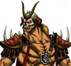
My design of Shinnok in his elder god robes. I made it really fancy since he was a former elder god and i added some old parts to his costume from mk 4. ***Please comment if you rate! Thank you.
|
| Full Scale | 1521x1950 | Category | Drawings (Digitally coloured) | User Views | |
| User Likes | User Ratings | 11 | Score |
|
0
I definitely love the color scheme, IMO it flows really well. I love this design, Shinnok looks like a BAMF. A pinkish aura that we saw at the end of MK9 would look pretty good IMO, maybe not with this color scheme but I would like to see it happen. 5/5

About Me
0
Thank you all very much!! I didn't want to add any more detail to the shoulder pads or boots cause I thought that it would be a too much with all the other stuff going on his wardrobe.

0
Looks great to me. Although...Shinnok's always looked kinda silly to me, and I wonder if it isn't his color scheme. Specifically, the bright teals and greens. No fault of yours, mind you, that is what he wears in the games...I just wonder if it wouldn't look better in a much darker shade. I think his robes were darker in Mythologies and didn't look too bad.


About Me
0
RazorsEdge701 Wrote:
Looks great to me. Although...Shinnok's always looked kinda silly to me, and I wonder if it isn't his color scheme. Specifically, the bright teals and greens. No fault of yours, mind you, that is what he wears in the games...I just wonder if it wouldn't look better in a much darker shade. I think his robes were darker in Mythologies and didn't look too bad.
Looks great to me. Although...Shinnok's always looked kinda silly to me, and I wonder if it isn't his color scheme. Specifically, the bright teals and greens. No fault of yours, mind you, that is what he wears in the games...I just wonder if it wouldn't look better in a much darker shade. I think his robes were darker in Mythologies and didn't look too bad.
yeah wondered why nrs went with a bright tone for him? I was going to draw an alternate for shinnok but have darker colors. i just need to be motivated again to finish the alternate.
RazorsEdge701 Wrote:
Looks great to me. Although...Shinnok's always looked kinda silly to me, and I wonder if it isn't his color scheme. Specifically, the bright teals and greens. No fault of yours, mind you, that is what he wears in the games...I just wonder if it wouldn't look better in a much darker shade. I think his robes were darker in Mythologies and didn't look too bad.
Looks great to me. Although...Shinnok's always looked kinda silly to me, and I wonder if it isn't his color scheme. Specifically, the bright teals and greens. No fault of yours, mind you, that is what he wears in the games...I just wonder if it wouldn't look better in a much darker shade. I think his robes were darker in Mythologies and didn't look too bad.
Yet Shinnok definitely has potential to look stylish as well, it's only a challenge for an artist to make that happen. See: The Joker's style makeover for The Dark Knight. As for this art, it's a well done piece. Those horns remind me of your Shao Kahn. The choice to use less red was right.


About Me
Mortal Klaybat #1 - Shinnok, Shao Kahn, Sektor, Noob Saibot and Ermac! 
0
That's absolutely fantastic. Nice touch with the green eyes I suggested, makes him more ominous than evil, 'cuz you know, hes no Netherrealm thug.
When I first saw it, did'n like the shoulder pads, but now I'm all for them in, but it's (along with the boots) kinda bland, could have some design in them, like, umm...the Netherrealm kamidogu, but then I'd have to give it a 7/5.
Great job man.
When I first saw it, did'n like the shoulder pads, but now I'm all for them in, but it's (along with the boots) kinda bland, could have some design in them, like, umm...the Netherrealm kamidogu, but then I'd have to give it a 7/5.
Great job man.


0
I like it, but I think he needs a bit more red in his clothes like his original design. Way too much blue.


About Me
Mortal Klaybat #1 - Shinnok, Shao Kahn, Sektor, Noob Saibot and Ermac! 
0
blacksaibot Wrote:
I like it, but I think he needs a bit more red in his clothes like his original design. Way too much blue.
I like it, but I think he needs a bit more red in his clothes like his original design. Way too much blue.
Yeah, like, having his pants/undershirt red instead of that jade green.


About Me

 Modified sprites!I am Paint.NET and GIMP user!
0
Awesome , very neat! I like it, keep it up, u've got a talent!


About Me
0
Thank you very much!!
Pages: 1
© 1998-2024 Shadow Knight Media, LLC. All rights reserved. Mortal Kombat, the dragon logo and all character names are trademarks and copyright of Warner Bros. Entertainment Inc.


