
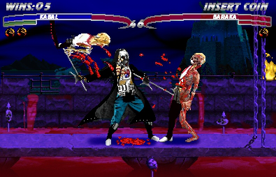
Redesigned Kabal finishes Baraka.
Fan Kreations
Pages: 1
Display Mature Content:
| Artist's Remarks: | |
|
This is one of two redesigns of Kabal that I did. The idea of the Fatality is that he grabs his opponent with his hooks and pulls his flesh off. I admit that I got the sprites from the MKWherehouse, but I tried to edit them at least in someway.
|
| Full Scale | 395x254 | Category | Fakes | User Views | |
| User Likes | User Ratings | 8 | Score |
 3.5 3.5
|
0

Pages: 1


© 1998-2025 Shadow Knight Media, LLC. All rights reserved. Mortal Kombat, the dragon logo and all character names are trademarks and copyright of Warner Bros. Entertainment Inc.