

Pit uppercut
Fan Kreations
Pages: 1
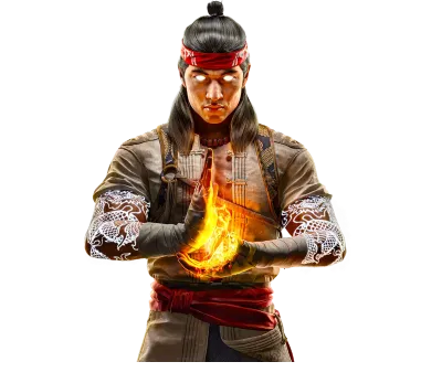
| Artist's Remarks: | |
|
There are some graphical glitches with this one but it is my favourite fake because it is so original.
|
| Full Scale | 395x507 | Category | Drawings (Digitally coloured) | User Views | |
| User Likes | User Ratings | 4 | Score |
 2.5 2.5
|


Pages: 1


© 1998-2025 Shadow Knight Media, LLC. All rights reserved. Mortal Kombat, the dragon logo and all character names are trademarks and copyright of Warner Bros. Entertainment Inc.
