
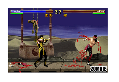
LIU KANG IS DEAD check out my first fake!
Fan Kreations
Pages: 1
Display Mature Content:
| Artist's Remarks: | |
|
the stench of rotting human carcass hanging in the sun, scorpion kills liu kang for mysterious reasons...... enjoy! this is my first fake , all done in photoshop, i did something to almost ever object/sprite.
|
| Full Scale | 472x328 | Category | Fakes | User Views | |
| User Likes | User Ratings | 9 | Score |
 3.0 3.0
|


Pages: 1


© 1998-2025 Shadow Knight Media, LLC. All rights reserved. Mortal Kombat, the dragon logo and all character names are trademarks and copyright of Warner Bros. Entertainment Inc.