
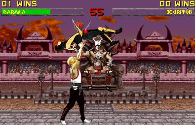
first fake..not that good
Fan Kreations
Pages: 1
Display Mature Content:
| Artist's Remarks: | |
|
its kind of pathetic..i chose a bad background aswell because you can barely see Baraka's claw. Sorry about where hes stabbing him, didnt do that on perpouse!^-^'
|
| Full Scale | 395x254 | Category | Fakes | User Views | |
| User Likes | User Ratings | 4 | Score |
 1.5 1.5
|


Pages: 1


© 1998-2025 Shadow Knight Media, LLC. All rights reserved. Mortal Kombat, the dragon logo and all character names are trademarks and copyright of Warner Bros. Entertainment Inc.