Chaos Realm -Fake-
Fan Kreations
Pages: 1
Chaos Realm -Fake-
0
posted05/07/2009 09:41 PM (UTC)byMember Since
06/29/2003 04:54 AM (UTC)

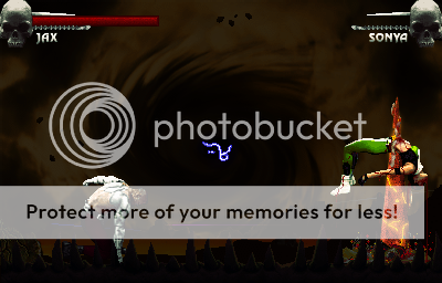
Here's the non-obscured fatality version so you can see a bit better

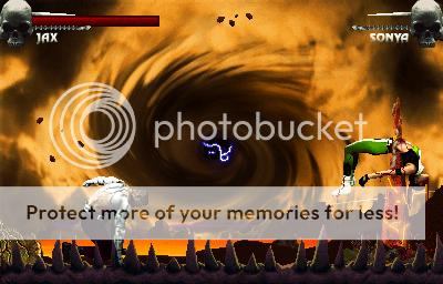
and this is the plain stage

I know the lifebars suck... they where just experimental... what if you actually ran out of bar as you get hit... they dont look too good... but oh well...
And just in case ppl dont understand, the colored beams in the BG are supposed to be the transporters hehehe
Background: pretty awesome. good colour scheme you've got going. I only just noticed the floating debris now and it's a really subtle touch. The teleport beams in the background are a good idea but they didn't come out all that well. I can't really think how to make them better sorry. I like how you merged the MKII portal with teh one in MK4 (I think).
Sprites: Would've liked to see a little sprite editing but meh. The fatality is great both in idea and execution, especially how you added electricity to the spire. The blood coming out of sonya looks tops except for on her feet: looks more like a dangling string and doesn't really need to be there considering the was impaled out her stomach. Kinda wanna see something on jax to show his power, maybe a bit of the same amber electricity centred around his hand/forearm?
I actually like the lifebars, they're different. Not really as noticable which is good.
I love everything. Really, really awesome stuff here.
I just don't like the idea of the fatality, and even though I don't like it, it still looks great. I love the blood flowing from Sonya's mouth- it absolutely should be there. You try getting impaled through your stomach, I bet you'll throw up shitloads of blood as you die.
Great bg. Very subtle but well done and consistent.
And I do like the lifebars too.
0
Zentile Wrote:
I love everything. Really, really awesome stuff here.
I just don't like the idea of the fatality, and even though I don't like it, it still looks great. I love the blood flowing from Sonya's mouth- it absolutely should be there. You try getting impaled through your stomach, I bet you'll throw up shitloads of blood as you die.
Great bg. Very subtle but well done and consistent.
And I do like the lifebars too.
shiiit.... a rave review from Zentile!!!
AWESOME!!!!


About Me
0
The blood coming out of Sonya's mouth is great and it's a good idea. The background is also quite lovely although I think the transition between what I'm guessing is a sea of lava and the portal in the background is a bit sudden. But still a great fake! 4/5
Even if Sonya dies.
Even if Sonya dies.


About Me
Why are you reading this?
0
This is fuckin' fantastic. Keep up the good work man.


0
number 2!
I'm with Zentile on this one. I don't really like the fatality concept, but the scene as a whole is a great concept.
I'm with Zentile on this one. I don't really like the fatality concept, but the scene as a whole is a great concept.
Pages: 1
© 1998-2024 Shadow Knight Media, LLC. All rights reserved. Mortal Kombat, the dragon logo and all character names are trademarks and copyright of Warner Bros. Entertainment Inc.


