I understand this was a passion project, and it's clear a great deal of work went into it. And that's commendable. SO for that the book has my praise and admiration. BUT that said, it's far from perfect. So... while I appreciate the work that went into it, I have a lot of notes. I say these things more for the sake of improvement, and not just to be critical for the sake of being critical.
I used to do a lot of editing and proofreading back in the day...
I gave the whole book a once over. Not a thorough read, but I thumbed through every page, and I found a LOT of errors, without even looking for them. I don't mean objective story errors, that might be considered a matter of opinion. I mean cut and dry grammatical errors. Typos. Spelling mistakes. It's pretty clear this thing hasn't been thoroughly proofread.
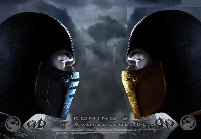
I find many of the image choices questionable or bad. There are a lot of good images in the book, but I'd still cut several. Many of the full page pics are clearly blown up larger than they should be, and are grainy and pixelated as a result. I saw what appeared to be a few pieces of fanart here and there that I'd advise removing completely, I appreciate the official concept art, but fanart is out of place in an encyclopedia. Especially the large two page spread of several different Scorpions and Sub-Zeros... that struck me as very out of place... and it doesn't match the aesthetic of the rest of the book (the two pages don't even match one another, which is jarring). I also disliked the photoshop character collage that kicks off the character section. Bad photoshop is bad. Too many clashing art styles and light sources in that collage. Just use the standard Armageddon roster image.
For bad image examples see Mokap, Moloch, Kobra, Kira, Kai (Dear god especially Kai, that pic is terrible. A grainy closeup of hands and crotches is NOT a good full page image choice.)
I don't like the little flavor taglines in the upper righthand corner of some of the profiles. They come of very fan-fic cheesy. Take Jax for instance, "The Special Forces Major" that's... terrible. And making them all start with "The" sounds so cookie cutter forced. And some of them, when removed from context, are misleading... Mileena's for instance "The Queen of Outworld" ... that's debatable. She's the self proclaimed and heavily disputed Emperess (*Cough* Not Queen *Cough*) of Outworld, after the far more prominent and well known emperor dies. She literally spends half a game KINDA having the title... and then dies. It's not like that's her defining character trait. ANYWAY I'd just delete these flavor blurbs entirely as they're... not well executed in many cases. And furthermore half the characters don't have one to begin with.
I hate the "real name" section of every profile, because the majority of them don't give an actual real name, which runs contrary to the point of having a real name listed. Somehow I REALLY doubt Frost's "real name" is Frost... anyone who doesn't have a confirmed real name should just say unknown or unrevealed. Don't put an obvious codename into the "Real Name" section just because you lack a real name. Furthermore some of them aren't even correct. Kenshi's just says Kenshi, but we KNOW Kenshi's full name.
I'd rename the Kanvas images "Koncepts" because... that's what they are. What does Kanvas even mean? It's silly. Many of them aren't paintings. Digital art and drawings aren't done on canvas. ANYWAY... I like the use of official concept art. I dislike the ones that are partially cropped comic book art or fan art (See Jarek, Reiko). Bo Rai Cho has an actual 3D render of his Deadly Alliance alt costume, for reasons I don't understand. Anyway, I'd keep the Kanvas sections, but ditch/replace a few of them.
Speaking of 3D renders, a couple look like they were taken from model viewers, and don't look good. Jade is one of the most obvious offenders... I'd steer clear of her mobile model and just use a high quality MK9 render. Nightwolf also looks unusually poor. (Nevermind all the PS2 era renders, many of those look poor, but I understand why. MK9 and MKX era characters have no excuse. High quality renders exist for most of them.)
I appreciate the idea behind the Kombat Threads, but I think a lot of them are poorly done. I scrolled past many and said, "Why did they leave out this game" or "Why did the leave out this alt?" only to eventually find ALL the missing costumes were haphazardly thrown into the final pages of the book, which struck me as needless and sloppy. I'm ASSUMING the ones that were skipped were skipped due to space issues, as it's hard to fit every costume for some characters... but the way they were all just tacked on at the end with little rhyme or reason was bad. I think there was some decent logic shown in leaving out the ones you did for the most part... but... I'd just cut the pages at the end. Don't really need the random "here's all the costumes we skipped for no reason" pages. ... Also I'd break Noob's into two sections separating Sub-Zero and Noob. It's weird visually to jump from one to the other. Makes for a disjointed visual timeline. (Possibly the same for Smoke, though he's a little more forgivable)
Some of the portions I read were okay. Some were poorly written. Some seemed lifted from in-game text verbatim, which I kind-of disliked. I'm pretty sure I saw at least one paragraph I wrote myself lifted from the MK wiki.

... Anyway... I feel like the writing lacked unity, for those reasons. But. Again, it's a passion project... so. *Shrug* I think this is another area where the book would benefit from a thorough proofread. Sometimes having one person sit down and do edits to the whole thing is a good way to find paragraphs that make you go, "Wow, that sounds stupid" do some re-writes, and bring more narrative unity to the piece as a whole.
Finally, I hate that only a couple characters (Quan Chi, Sub-Zero) got 4 pages. If at all possible, I'd Edit them down to 2. I understand why some of the characters with lighter bios would only need 1 plus a full-page pic. But if you're devoting 4 pages to a character in a book where EVERY other character has 2... you're not Smacking him hard enough with the edit stick.
This made me ask, "How did they get Raiden and Scorpion into 2 pages, if not these two?" so I looked at Raiden and Scorpion and noticed their bios are much longer paragraphs, with smaller text, wheras Quan Chi and Sub-Zero have theirs broken up into several paragraphs of larger text. Honestly I think I prefer multiple paragraphs. I dislike how Raiden's runs together as one long block. So... I dunno. Pros and cons both ways. But still, I'd try harder to parse those two down to two pages.
ANYWAY...
That's my pile of unsolicited notes. I don't mean to be a jerk... just... calling'em like I see'em really. Again... I appreciate the hell out of this project, and would love to see a more polished version in print one day. So thanks a ton to its creators for trying to get the ball rolling.


