


Dark Sub-Zero
Dark Sub-Zero

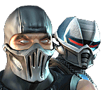
This is not a Sube-Zero noob hybrid dammit. All ym friends say dude that sub/noob hybrid. Tell me what you think I just wanted to draw a badass looking sub-zero. So tell me what you think. I like this pic I think I will add a back ground any suggestions?

About Me

Thanks to DeathBlitzX for the tag!
0
Dude, that is so awesome, one of the best pieces of art I've seen here in a while. I really like the clothing and his design, nice job. The coloring and shading is also very nice, considering it looks like you did it on notebook paper with some colored pencils or something. The double freezeballs seem like a nice idea too. I like how the forearm bands look like they say LK for Lin Kuei.
Even though I know this is younger Sub-Zero by the scar, and that it's not supposed to be a hybrid...but I've always had an idea of Noob Saibot somehow becoming Sub-Zero again. I always thought it'd be an interesting plot element for MK, and that's one reason I really like this. The only thing I see wrong with it is that his arms and legs look too big. Again, excellent work.
Do you take requests?
0
Man, that's badass.
0
hi buddy it was realy bad.

About Me
0
I was thinking the exact same thing, but you drew it.
And drew it Beautifully i might add, nice one!
And drew it Beautifully i might add, nice one!


Yeah I did use colored pencils. I have pastels but i have no idea how to use them properly what a waste of money. 2 dollars a damn pencil. I did use notebook paper cause i reserve blank sheets for stuff that's more intricate. If you notice my other works you'll see i just use a black gel pen to color in the black areas. I wanted to try comething new so I layed down first layer of indigo blue and went over it with a black colored pencil then i just took the gel pen and added the black you see. I think it worked famously and this is definitely one of my favorites just because it taught me something new.
Yes I can do requests. No porn. Mutilations preffered.
Yes I can do requests. No porn. Mutilations preffered.

About Me

MK Online Featured User 31/3/2010 12/4/2011
-----------------------Gifts-----------------------
Shinnok-fan64 - s3Kt0r
0
Nice drawing

About Me

0
Fantastic drawing! 5/5
About Me
Thanks to DeathBlitzX for the tag!
0
Kombosus Wrote:
Ouch crow hurt my feelings he just warned me and didn't even comment me on my drawing. I never did like goths. I'm gonna go cry now. Once more any siggestions for backgrounds?
Ouch crow hurt my feelings he just warned me and didn't even comment me on my drawing. I never did like goths. I'm gonna go cry now. Once more any siggestions for backgrounds?
Dude, knock it off. You're just gonna get in more trouble now.


About Me

0
You people will give anything 4/5 or 5/5.
Edit: Yoink!
Edit: Yoink!
I got the proportions wrong on purpose manga artist=manga drawing I suppose I should have said that though. Please remove the picture of barnie the scorpion from my thread. And since chrome took the grand luxury to nit pick at my drawing I'm going to criticize his. The head is way outta shape and the cowl can not explain that at all. There is exactly 0 neck in that picture the face is way to big and the legs are mis shaped the costume though well designed looks blocky and inanimate albeit the same could be said for mine. the body laying in the background is one big mistake and a human spine looks NOTHING like that. Over all I give it a 1/5.
I think it looks cool. I like the Chinese symbols you added to his gloves, and that scar on his face gives and extra 'badaz' detail.
Try doing this cleaner, more smooth, and a little more straight on a xerox paper (white paper), it would make the outcome look much nicer.
But maybe you can add something more from one of Sub-Zero's costumes, because if you didn't tell me that it was a picture of him, (and if there was no color) I would of never of guessed that being Sub-Zero. So maybe you can add a medallion from MKDA or something.
3/5
About Me
0
Kombosus Wrote:
I got the proportions wrong on purpose manga artist=manga drawing I suppose I should have said that though. Please remove the picture of barnie the scorpion from my thread. And since chrome took the grand luxury to nit pick at my drawing I'm going to criticize his. The head is way outta shape and the cowl can not explain that at all. There is exactly 0 neck in that picture the face is way to big and the legs are mis shaped the costume though well designed looks blocky and inanimate albeit the same could be said for mine. the body laying in the background is one big mistake and a human spine looks NOTHING like that. Over all I give it a 1/5.
I got the proportions wrong on purpose manga artist=manga drawing I suppose I should have said that though. Please remove the picture of barnie the scorpion from my thread. And since chrome took the grand luxury to nit pick at my drawing I'm going to criticize his. The head is way outta shape and the cowl can not explain that at all. There is exactly 0 neck in that picture the face is way to big and the legs are mis shaped the costume though well designed looks blocky and inanimate albeit the same could be said for mine. the body laying in the background is one big mistake and a human spine looks NOTHING like that. Over all I give it a 1/5.
Lol, jealousy.

About Me

0
Ninja_Mime Wrote:
You people will give anything 4/5 or 5/5.
This is 5/5 work (By Chrome):

Kombosus' work is not.
1.5/5.
You people will give anything 4/5 or 5/5.
This is 5/5 work (By Chrome):
Kombosus' work is not.
1.5/5.
Stop being an ass. He wants to hear construcive criticm, Don't post other people's work on someone else's thread.
any way. Pretty good drawing , excellent colouring...
About Me
0
Zentile Wrote:
Ninja_Mime sucks.
Ninja_Mime sucks.
Aww, dang.
Ok guys settle down. All I want is some criticism. Ninja_Mime if your not gonna contribute anything useful do not post. I do not care what you think of Chrome's work stop being a follower and come up with your own opinions. I know your gonna say I still suck and a whole bunch of other mean things so don't waste your time because I don't care. That's why my sig has a line in it for people just like you. So stop wasting decent people's time and flame some other people. Now if you have some REAL criticism on the other hand, I'd be happy to hear it. Jealousy is not a famous emotion of mine because I have next to none. Chrome is a great artist and I respect him for that. It just hurts when you work on something only to have it bluntly torn down in one sentence. With no compliments on what you did well at all. It does not let me know what I am good at and that makes it harder for me to become better.
About Me
0
Okay.
His arms are way too long, even if they are supposed to be out in front of him. It still looks extremely flat. As for the concept of the drawing, I don't think it's anything spectacular. It just looks like any old ninja with black skin. The costume is boring, and the iceballs look too cartoony.
1.5/5.


© 1998-2024 Shadow Knight Media, LLC. All rights reserved. Read our Privacy Policy.
Mortal Kombat, the dragon logo and all character names are trademarks and copyright of Warner Bros. Entertainment Inc.