
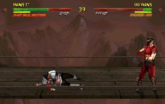
.:: Fake Pic: Gorge versus Ravage ::.
.:: Fake Pic: Gorge versus Ravage ::.
0
posted07/21/2005 05:27 PM (UTC)by

I apologize if this appears arrogant to all you amateurs, but I am in absolute awe of the perfection contained within the whole of this image. Very rarely will your see me boast about one of my images, but one would have to be virtually insane not to feel that this is one of fake image produced in the history of the industry. Attention to detail is such a high priority and such a massive factor within this image that one would have to examine it scrupulously just to pick out some of the most obvious of the minute details.
I will not pinpoint exactly what I did, but if anyone can guess which MK chraracter I used, I'd be astonished, because half of you don't even half the IQ to identify the base image used for your own damn sprites.
I am aware that it's not clear as to exactly what it is that Gorge is doing, standing there in some Mr. Universe pose or some shit. Yes, he is posing, but he's getting ready to return to his stance. This isn'rt supposed to be similar to any MK sprite in any MK installment. Gorge is a completely custom sprite, while Ravage, the guy bleeding on the ground, is a minimally modified edit with a ton of small details that only a tried professional would pick out.
I'm looking for expressive, constructive feedback here. Or, you can be a smartass and type out lame one-liners that are just about as bad your own fakes. Hit me.
EDIT: Fucking Christ I love the way this message board's HTML was done. It cuts off half of my damn image. Anyway, here's the URL to the image: Gorge versus Ravage.
I dont like it. First of all, the whole thing screams blah. All the colors are so bland and dull. The mountains in the background look too blurry. I mean you should try to shade them with more detail. The Smoke rip off character looks pretty good but if youre making him as a new character at least put some unique features on him. Gorge doesnt even look like he belongs in the MK universe. And why is Ravage injured on the ground? You give no hint as to how he was hurt. wtf is a 19 hit skull splitter? It looks and sounds more like a Killer Instincts fake. The bridge lacks the detail that can be seen in recent fakes, but the ropes are a nice touch. Overall its boring. I give it 4/10, the effort is there, just not the passion.
0
MKVII Wrote:
I dont like it. First of all, the whole thing screams blah. All the colors are so bland and dull. The mountains in the background look too blurry. I mean you should try to shade them with more detail. The Smoke rip off character looks pretty good but if youre making him as a new character at least put some unique features on him. Gorge doesnt even look like he belongs in the MK universe. And why is Ravage injured on the ground? You give no hint as to how he was hurt. wtf is a 19 hit skull splitter? It looks and sounds more like a Killer Instincts fake. The bridge lacks the detail that can be seen in recent fakes, but the ropes are a nice touch. Overall its boring. I give it 4/10, the effort is there, just not the passion.
I dont like it. First of all, the whole thing screams blah. All the colors are so bland and dull. The mountains in the background look too blurry. I mean you should try to shade them with more detail. The Smoke rip off character looks pretty good but if youre making him as a new character at least put some unique features on him. Gorge doesnt even look like he belongs in the MK universe. And why is Ravage injured on the ground? You give no hint as to how he was hurt. wtf is a 19 hit skull splitter? It looks and sounds more like a Killer Instincts fake. The bridge lacks the detail that can be seen in recent fakes, but the ropes are a nice touch. Overall its boring. I give it 4/10, the effort is there, just not the passion.
hell, at least its better than this

8/10 for the fake


0
It could have been better. There should be another character there. Plus the lifebars look stupid.

0
Veno, THAT's the URL? I tried it several times and the most I got out of it was a whole page of weird text. You sure you don't have a version with a picture extension at the end like JPEG, GIF or something?
0
Since the link isn't working for me, and I assume it probably won't work for some other people, I decided to host it on my photobucket profile to help...
Click here to see all of it. (it might look a bit different though, since I had to take a picture of my screen, cut out the image and re-save it...)
I don't have much to say about it, since I only posted to help, but I think it's great. The sprite edits look much more polished and creative than the others I've seen here, but like you asked, I'll try to post some constructive criticism...
- The font for their names are a little hard to read, and it would make more sense for the names to be capitalized...
- I like the idea of a bridge in the mountains, but it would be a bit cooler if there were a couple cracks and stuff on the bridge, so that it doesn't look "brand new"...
- One of Gorge's arms looks smaller than the other, I understand that it might be because it's slanted or farther away, but it still looks a little odd...
- Gorge's muscle definition looks weird too. On his left arm (our right) there seems to be one big muscle line going down his arm. If it's a scar, my bad, but try to make it more obvious next time. Maybe with blood dripping from it or something...
- Does Gorge have boobs? The top part of his shirt seems to be a bit puffy. Maybe he just has big pectorals though...
- Ravage's legs look positioned oddly, but maybe he's just getting up...
- The "19-hit skull splitter" and "injured-jaw" look out of place. I'm not sure what they are...
- You said the guy on the ground bleeding is Ravage, and the other guy is Gorge, but the lifebars are on the opposite side of their characters. It's not very imprtant though...
Other than that, i think it's great. Definitely better than most of the stuff here. I suggest that other members save the picture and zoom in, just to see how much detail it has...
Hmm, okay. The font you used for their names is a little hard to read. The Win Dragons seem out of place just sitting their on the sides. For MK sprites, the charecters seem a bit too large. The glow on the status text seems too fake/photoshopped in my opinion. But, I do love the lifebars, I've seen you use the same effect before. I like the stage, hasen't really been seen in MK fakes. I like the injury status idea. I think the sprite edits are superb and I love the blood.
Overall: 8.5/10
Overall: 8.5/10
MKVII Wrote:
I dont like it. First of all, the whole thing screams blah. All the colors are so bland and dull. The mountains in the background look too blurry. I mean you should try to shade them with more detail. The Smoke rip off character looks pretty good but if youre making him as a new character at least put some unique features on him. Gorge doesnt even look like he belongs in the MK universe. And why is Ravage injured on the ground? You give no hint as to how he was hurt. wtf is a 19 hit skull splitter? It looks and sounds more like a Killer Instincts fake. The bridge lacks the detail that can be seen in recent fakes, but the ropes are a nice touch. Overall its boring. I give it 4/10, the effort is there, just not the passion.
I dont like it. First of all, the whole thing screams blah. All the colors are so bland and dull. The mountains in the background look too blurry. I mean you should try to shade them with more detail. The Smoke rip off character looks pretty good but if youre making him as a new character at least put some unique features on him. Gorge doesnt even look like he belongs in the MK universe. And why is Ravage injured on the ground? You give no hint as to how he was hurt. wtf is a 19 hit skull splitter? It looks and sounds more like a Killer Instincts fake. The bridge lacks the detail that can be seen in recent fakes, but the ropes are a nice touch. Overall its boring. I give it 4/10, the effort is there, just not the passion.
The whole thing screams "blah"? It's not supposed to be a fruity-ass rainbow-colored image. It's dark. It's gloomy. I did it for a reason. Trust me, if you were here before I lost access to the internet two years ago, you would've seen that I have a thing going on with all the dark, grusomeness that the MK world should revolve around--well, at least in my eyes. The mountains are blurry because there's a haze--a fog, for anyone who lacks a slightly extended vocabulary--in front of them. It's quite obvious, in my opinion.
I have no idea how Ravage could be considered anything close to a "Smoke rip-off," as you so boldly stated, since the only thing that even remotely resembles Smoke here is the gray of his uniform. He's injured because Gorge performed that vicious nineteen-hit combo on him.
If you had even half the IQ of a mentally-challenged ten-year-old, you'd realize that a 19-Hit Skull-Splitter is a nineteen-hit combo that ultimately, well, splits the skull. Maybe it doesn't literally split the skull, but I kind of guessed (and I probably shouldn't have even assumed it) that most of you would exercise your brains a bit and calculateThe result--brain damage. Seeing as I have implemented my own ideas here (obvious as well, since absolutely nothing bar the Ravage sprite on the ground and the floorboards for the bridge resembles something from the MK scene with which we're all so familiar), the player is notified of injuries, and injuries, like in Tao Feng (although this image was produced months before Tao Feng came into fruition), affect the maimed combatant's aggressiveness and power in any attacks following the injury.
Gorge isn't supposed to look like he belongs to the MK universe. If you'll notice, as I said before, practically nothing resembles anything from any of the MK installments. I've never even seen an image from let along played Killer Instinct in my entire life, and I don't intend on doing so. My point is that I don't see how it can resemble Killer Instinct, but I guess it can, since I've never played it. Some fakes are bound to resemble characters from games outside of MK if you've been in the "business" as long as I have.
Okay, maybe the bridge is boring, but it's, again, as I stated previously, not supposed to be rainbow-colored. It ain't a Super Mario Bros. fake, guy.
I appreciate what you're eventually going to claim as "honesty", but it would appear that you have it in for me for some reason or another. That was somehow clear when I critiqued someone's fake and you tried to insult me, jokingly, I'm sure, because I laughed at it. It was humorous.
Anyway, I can't impress everyone, and my shit can't smell like potpourri to everyone--basically, my images aren't going to gather compliments from everyone, I can't satisfy everyone's taste.
By the way, I would respect you more, and I'm sure everyone can agree with me here, if you could create something even half as good as anything most of the newbies post here. You're untalented, you lack the ability to improve, I'm sure, and you're just attacking anyone and everyone who has talent that blows yours out of the water. You compliment images that look like shit, and bash some of the most impressive ones here. I don't know, maybe you're trying to motivate the ones who lack all forms of talent and you're trying to bring the best down to the level of the rest of the...I'd say competition, but this is a Goddamned cake-walk compared to what this forum used to be.
About Me
-Peace out, cubscout.
0
Yes; this is an excellent fake. I like the uncertainty of the fighters actions. Nearly all fakes are nothing more than overly-bloody Fatalities but you opted to show them mid-fight. So, from a design and concept stand point, its about as daring as you can get on a message board. I also like the subtlety of the colors, especially on Gorge. Good stuff.
Uh, if I had to make any suggestions... Well, I believe you already stated you dont like custom backgrounds, but if you are going to make one, I say go all they way. I dont think images need to be colorful or corny but perhaps if you thought about giving the background some story. You already put a hell of a lot of work into the sprite edits, so why not go the extra step? For example, Ive been working on a background tentatively titled The Factory of Death, and I started out by literally writing a short story about the realm the factory is in and what the purpose of the factory is.
Ok, Ill shut up now. Who the hell am I to be giving you suggestions?
cartmansp Wrote:
Since the link isn't working for me, and I assume it probably won't work for some other people, I decided to host it on my photobucket profile to help...
Click here to see all of it. (it might look a bit different though, since I had to take a picture of my screen, cut out the image and re-save it...)
I don't have much to say about it, since I only posted to help, but I think it's great. The sprite edits look much more polished and creative than the others I've seen here, but like you asked, I'll try to post some constructive criticism...
- The font for their names are a little hard to read, and it would make more sense for the names to be capitalized...
- I like the idea of a bridge in the mountains, but it would be a bit cooler if there were a couple cracks and stuff on the bridge, so that it doesn't look "brand new"...
- One of Gorge's arms looks smaller than the other, I understand that it might be because it's slanted or farther away, but it still looks a little odd...
- Gorge's muscle definition looks weird too. On his left arm (our right) there seems to be one big muscle line going down his arm. If it's a scar, my bad, but try to make it more obvious next time. Maybe with blood dripping from it or something...
- Does Gorge have boobs? The top part of his shirt seems to be a bit puffy. Maybe he just has big pectorals though...
- Ravage's legs look positioned oddly, but maybe he's just getting up...
- The "19-hit skull splitter" and "injured-jaw" look out of place. I'm not sure what they are...
- You said the guy on the ground bleeding is Ravage, and the other guy is Gorge, but the lifebars are on the opposite side of their characters. It's not very imprtant though...
Other than that, i think it's great. Definitely better than most of the stuff here. I suggest that other members save the picture and zoom in, just to see how much detail it has...
I appreciate the help with the link. Giving out the link usually works, but Angelfire is being a bitch. Anyway...
I know the font is hard to read, but I thought it looked nice at the time I constructed this image. I've actually managed to create my own font, and it's in all fakes that follow this one. It's a lot easier to read, and resembles the MK fonts of old to some extent.
Yeah, I had planned on throwing some wear-and-tear on the bridge, like water damage and all that shit, but I decided I'd just slap them onto the background and get it finished. I spent more time thinking of a background than I did creating the sprites. Weird, I know.
The position of Gorge's arms is what makes the one in the back appear smaller. It looks strange at first, but it takes a little more scrutiny to realize it. And the comment about the line going down his arm--well, it's just how it was in the base sprite I used. I could edit it, but I think it's just too trivial to waste time on.
The breastplate looks fucked up because I got sick of editing it. I had intened on making it look flatter, but he is one hefty son of a bitch (his complete bio will eventually be implemented into a site unrelated to MK that I own). I was also intitially going to add nicks and scrapes on the armor, but I didn't. Meh.
Ravage's legs are positioned like that because he's in the process of attempting to stand, but he's dazed. There's this huge story behind the fake that I could post, but I doubt I will.
I really appreciate critiques like this. I love the real honesty.
I may be average at making fakes, but I have a very keen eye for all aspects of art. I gave you some constructive critcism and you retort like a rabid guard dawg with your 6th grade 'IQ' insults. Trust me, you're not impressing anyone. You say Ravage was injured by the 19 hit skull splitter which I already pointed out in my first post, yet you fail to demonstrate any action of it in your fake. Since it's only a single frame, that is unnacceptable. The viewer gets no sense of what just happened except for looking at the name of some silly made up combo move. How can you say Ravage looks nothing like Smoke? He's clearly grey, and he's clearly wearing a very MK like ninja uniform. The small little extra details has minimal difference. If you expect to improve, you cant disregard every flaw or dislike someone states. Grow up.
The_Red_Dragon Wrote:
Yes; this is an excellent fake. I like the uncertainty of the fighters actions. Nearly all fakes are nothing more than overly-bloody Fatalities but you opted to show them mid-fight. So, from a design and concept stand point, its about as daring as you can get on a message board. I also like the subtlety of the colors, especially on Gorge. Good stuff.
Uh, if I had to make any suggestions... Well, I believe you already stated you dont like custom backgrounds, but if you are going to make one, I say go all they way. I dont think images need to be colorful or corny but perhaps if you thought about giving the background some story. You already put a hell of a lot of work into the sprite edits, so why not go the extra step? For example, Ive been working on a background tentatively titled The Factory of Death, and I started out by literally writing a short story about the realm the factory is in and what the purpose of the factory is.
Ok, Ill shut up now. Who the hell am I to be giving you suggestions?
There actually is a story behind the background. The bridge was originally supposed to be a lot less wide, but the sprites didn't fit so well on the smaller version. The background is from a site I own, and it's entitled The Bridge of Fears. Here's the back story:
Connecting the Erraván mountain chain and the Glacial Cliffs is the Bridge of Fears, a six-foot wide, mile-long creaking span of splitting wood and frail rope suspended 6,000 feet above the Polar Fields. With each and every exertion of pressure upon the bridges tired surface, one is stricken with the very meaning of fear, hence the arenas namesake. It is also the first of a handful of the arenas that requires the use of the Dark Legions ultramodern technology. Spanning the full extent of the bridge are numerous cameras, offering spectators live video feedsas well as the only means of observation by all onlookers. In addition to the filming devices, an announcing system has been bound to one of the colossal mountainsides, an apparatus by which the duel master is able to call the match. In the morning hours, a thin, colorless mist lingers over the plane of the bridge, offering even fewer comforts on this already daunting expanse of passage.
** Stage Fatality: As one might have imagined, the triumphant combatant has the option to hurl his or her antagonist over the side of the bridge, where the unlucky party will plummet to a back-snapping death on the frozen floor of the Polar Fields.

About Me

0
I fucking hate the fact that every single fucking fake image posted here absolutely must be a fatality image, otherwise ignorant fucking thirty year olds who live in their grandparents' garage, like MKVII, attempt to destroy your motivation.
VenoMark, that's one sick image. You've always been superior at sprite editing, and you manage to prove it once again. Gorge looks like one bad-assed mother fucker. His design is very original. The level of detail you put into it is astonishing.
I like how you didn't make a background that would totally take my attention away from what was really happening. It doesn't look like some photograph you found off of some image search engine. I can tell you actually did a lot of editing on your own.
I'm not much of a fan for Ravage because I just think Zebra when I look at him. His left hand looks a bit cut off.
On one side it says Wins 17, but the other it says 00 Wins. It's kind of backwards.
Even though this isn't my favorite of yours, it's still very damn good and really stands out when you compare it to the other fake pictures you see around here.
About Me
Hahahaha...?
0
Pretty cool, I like how Ravage is laying there in pain. Gorge looks a little stiff though and the faceplate...well, to me, at least, doesn't look right. The background is awesome, and the ropes are a nice touch. This is a pretty good one. 8/10

About Me
<img src ="http://www.comixodez.com/Sets/mkosig2.png"
www.ComiXodeZ.com
0
Ok. My turn. :)
Definetly not ur best job, let's get that out the way.
The Blood: The blood was done well, but it just seemed out of place. Like, your fake is very realistic and so is the blood but it just seems that THAT blood looked a "little" out of place. It might be too bright or something. I can't put my hand on it but its something with the lighting and the contrasting of it with the body itself. (Something like that) That's what I FEEL from the blood. Other than that, its great looking.
The grey guy (Gorge I think): The one thing I noticed is his feet porportions. It seems a little off (the rope is covering it but you made the foot go too far off of it..it just seems to big compared to the other even though its at two different angles.) On the face I think there could of been just a little bit of light on it. Not too much but ya know what I mean. The little "in front tail" is little bit too blurry. (I'm looking at the link you gave me, not the cartman one so I have the good version.) The "back" leg of him should of been a little darker since its farther away from the viewer almost like the "back" hand on him (that should be darkened a little bit more as well.). The chest should be a little bit darker since the face is over it since the light source is above. Even though I'm a guy who doesn't care about shadows, you included one on the other guy and not on him.
Ravage: The right arm has some "fat" on the his bicep. His torso seems a little weird with his chest. It just seems abstract, that's all and the skin is a different shade (like he bot blacker there...lol.) On the legs, I don't know if you wanted it like this or not but the little buckle things are on the other side of his legs. Everything else is fine.
The Background: The fog is a nice effect...hazy and shit. I don't care if the bridge is beaten down (frankly alot of MK games didn't have broken ground anyways) but I like the bridge itself.
Others: I'm not complaining about the lifebar shit cuz frankly I can give a shit for that stuff...(I just like the characters and the background in a fake every thing can die.)...the fonts are nice though. The dragon placement is weird but I can see it being done.
Good Job. (I don't rate people who don't need it, you just look at my stuff that I think you should work on...everything is right.) ;) <3
The Zedox.
0
I haven't made a good fake or rated one in a while, but here goes:
Font is kinda hard to read, but besides that and the breastplate looks generic, I like it. I like how you actually edited stuff, MADE a bg, and all the detail you've got. I can't even tell the base sprite for Gorge, you did such a great job.
9.5/10
(P.S. Did Ravage get knocked back or something, cause if he didn't, he's too far away.)
0
Thats pretty good, but why Ravage is standing? I would like to see some actions.

0
Great job on the edits, no doubt about that. A few minus points:
- Red dude has a very detailed lower body and head, but plain arms and chest.
- The whole stage/background may be original, but that doesn't save it from looking boring.
- Lifebars and Fonts are too small.
- It's lacking action, but then again not every fake has to be a fatality...but it could at least be a normal attack or something.
Well it's still 8/10, for the great edits.
About Me

0
MKVII Wrote:
I may be average at making fakes, but I have a very keen eye for all aspects of art. I gave you some constructive critcism and you retort like a rabid guard dawg with your 6th grade 'IQ' insults. Trust me, you're not impressing anyone. You say Ravage was injured by the 19 hit skull splitter which I already pointed out in my first post, yet you fail to demonstrate any action of it in your fake. Since it's only a single frame, that is unnacceptable. The viewer gets no sense of what just happened except for looking at the name of some silly made up combo move. How can you say Ravage looks nothing like Smoke? He's clearly grey, and he's clearly wearing a very MK like ninja uniform. The small little extra details has minimal difference. If you expect to improve, you cant disregard every flaw or dislike someone states. Grow up.
I may be average at making fakes, but I have a very keen eye for all aspects of art. I gave you some constructive critcism and you retort like a rabid guard dawg with your 6th grade 'IQ' insults. Trust me, you're not impressing anyone. You say Ravage was injured by the 19 hit skull splitter which I already pointed out in my first post, yet you fail to demonstrate any action of it in your fake. Since it's only a single frame, that is unnacceptable. The viewer gets no sense of what just happened except for looking at the name of some silly made up combo move. How can you say Ravage looks nothing like Smoke? He's clearly grey, and he's clearly wearing a very MK like ninja uniform. The small little extra details has minimal difference. If you expect to improve, you cant disregard every flaw or dislike someone states. Grow up.
dude fakes don't have to be exactly like the MK games,they can be way different then an MK game.you don't even put timers,shadows,lifebars,or any of that stuff,you just put 2 sprites,some blood and that is all.
anyway for this fake i give it a 7.9/10


Ah, even though this pic is old, I still love it. The attention to the sprite detail is amazing except for those little minor errors. The bg, even though I get the idea of it, is a little..blah but hell atleast it is original and looks like it could be in an MK game. The only reason I don't think the bg looks excellent is the fake that the mountains and sky look a little low quality-ish. Overall though, the fake is superb and beats out most of the MK Fakes around here. Oh by the way the sprite you used is this one:

I only remember because you once showed me this fake while it was still in its sprite editing phase. That and I thought this sprite looked familiar.
Ah, well, for my review I will just waste my time because
(A) Zedox said everything I wanted to say.
(B) Well, you know whats wrong.
I would give you tips, but hell that would insult your ability, and you don't need them.
PS. Once again Venomark restarts the MK fake making spirit in us all.


0
Pretty good, but not very interesting.


© 1998-2025 Shadow Knight Media, LLC. All rights reserved. Mortal Kombat, the dragon logo and all character names are trademarks and copyright of Warner Bros. Entertainment Inc.