Sub-Zero ~ Blue
Sub-Zero ~ Blue
Display Mature Content:

| Artist's Remarks: | |
|
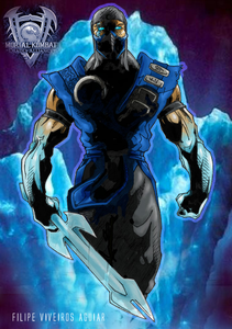
I used alot of shadow in this drawing so that I would'nt have to spend too much time coloring the rest in photoshop. Then, I aded that random ice background picture because it felt icy. And that MKDA logo, well...it looks pretty. :)
|
| Full Scale | 473x672 | Category | Digital Art (Other) | User Views | |
| User Likes | User Ratings | 35 | Score |
|
0
Woah =D!
This is great, but not the best. I've seen you done far more better. However, I like the whole ice idea you put together there. Plus Sub-Zero looks evil, the way you put him in the shadows =). So creepy .
I notied something about this, the way you made his weapon smaller than usual =O? Doesn't look all that great. And it would of looked better if you gave it that crystal-type clear effect, you know, how an ice cube looks, right? Well, it should of been done on his sword. But that's just my opinion on that behalf. The overall on your work is great, I like it =D!
Dragon points: 4/5
I agree that the weapon should be bigger and that a reflection effect or crystal effect on it would have being great.
Other than that, it is always a great pleasure for the eyes to see such great skills. You said that coloring isn't your speciality? You just proved yourself that you were wrong. You've improved.
It is a 5 dragons to my eyes.
Other than that, it is always a great pleasure for the eyes to see such great skills. You said that coloring isn't your speciality? You just proved yourself that you were wrong. You've improved.
It is a 5 dragons to my eyes.

0
well i must say i really like this, A LOT, it looks alot like his render... but not that much, after closer inspection, i love how you put him in the shadows, i could never do that very well, the coloring is very nice on this, some of the best ive seen, the sword does seem kind of short but not really, it could be a short sword  , very nice
4.5/5
4.5/5


About Me

0
whoooooooooooooooooooooooot phieeeeeeeeeeeeeeeeeeeeeeeeeeeeeeeeeeeeeeeeeeeeeet!!!!
(fartbunny says: Fantastic!!)
(fartbunny says: Fantastic!!)
About Me
The Storm Has Returned...
Realm of Khaos
0
I like that you colored your own artwork this time, it just makes you seem like a better artist. It's great work. 5/5 from me.
0
Wow thats awesome, this is something that should of been in the krypt in MKDA. Nice details and colors. Good job.
Dude, this is awwwwsome!! I do not know how you did it but from an artists point of view I think this pic is "THROWED!!" ITS OFF DA CHAIN. But if you didn't really do this and you just "copied" off of somebody then.... u suck! 5/5 WELL DONE!
This is nice indeed. It actually does remind me of something that would be used to promote a game. The drawing itself is superb, everything seems to be well in proportion. Also, I think you captured the 'walking' look almost perfectly. You can defiantlt tell the right arm is moving closer. I also like how you have done the eyes, I quite like the 'ice' look they have. And the transition of the different shades of blue is pretty much flawless in my opinion.
The use of shadows was well executed. They seem to follow a direct 'path', and don't seem random at all. Working with shadows is difficult for many I notice, but you've done it well here I think, nice job. The 'ice effect' on the arms is also nice. I like how it gradually comes into the arms, sometimes the mistake of just starting the ice effect with far too much contrast is made. But this is good, you worked it into the arms nicely.
The only real thing I don't like is the sword. Don't misunderstand, I think you drew it very well and its colored nicely for that matter, but it doesn't really fit Sub-Zero. The background ice is wonderful looking, and that is the sort of look I would have rather seen on his weapon. Another thing is the transparent blue outline that goes around Sub-Zero and his weapon, I suppose it is used to represent a sort of 'ice vapor' feel but I think it glows a bit too much. It would have been fine without it in my opinion. Anyhow, this is very cool, and like I said, this looks very much like something that could have been used to promote MKDA, great job.


About Me

0
Man, that is awesome. 5/5 Dragons from me.

0
Pretty nice is not enough, no, this is the best Sub-Zero pic ever! :D Very nice, I couldn't care less about the size of the sword, the drawing looks so fresh. And who cares about lens flares or sparkles in the weapon either...it's flawless like this. Jax007 is a pro, like he needs your tips and tricks...lol
Great pic.
Great pic.
0
That's a pretty conceited way to look at it, Linda, and you're not even the artist :P Every artist looks to improve no matter how long he's been drawing or how good he's become. So, yes, contrary to your blathering praise, JAX could always make his pictures better. That's not to say he needs to though. ;)
My comment on this would have to be I don't think the silhouette effect goes well with how you coloured this. There's too much Dark on his front and then too much vibrance on his flanks. Fuzz the black out some more, make the shadow more dominating. Personally, I think it looks like he took a walk and fell face first into a puddle of tar.
I'm assuming the light source is the iceberg behind him, in which case, to cast such a shadow on his front it'd have to have more of a Holy Light effect glowing out behind him. It doesn't feel like you're staring at him as he walks towards you as he blocks that one chunk of light behind him.
Your line work however is as lovely as it always it. ^_^

0
I just really like the pics, they are FLAWLESS. :)
0
Well I must say that this is a great piece of art, but I can't give it a 5. If you were trying to give Sub-Zero more of that darker look, then perhaps the face should be a bit darker looking. And of course my other little problem is that the Kori Blade is drawn too small, but you are already aware of that. However, the colors and the shadowing stuff is great as well as the way the body and costume are drawn so I give it 4 out of 5 Dragon points. You have done some great stuff in the past and you have not ceased to amaze me.


About Me
Join the Mortal Kombat Odyssey http://mkodyssey.net/
0
Wow... Totally awesome dude! As usual.
Though I didn't like that much the shadows on the face, but it's ok I guess! Great work!
Though I didn't like that much the shadows on the face, but it's ok I guess! Great work!
0
Wow, it's very, very, very nice. Good job on the coloring.


0
Thats damn perfect colors and the drawing is so intricate. 5/5
0
nice,but not ur best so far....but still its good really good,i need a new scanner so when i get it I'll be sure to post my drawings on the net.
0
how did u make the icy background in photshop?


About Me
 art by fear-sAs
0
I honestly think this has to be one of your best works. It's nicely detailed, and has a greate comic style. While the Kori blade is a bit small, it's not a big draw back. The lighting and shadows are very nicely cast, and the cross hatching on some of his clothing gives it a nice texture. I like the glacier background, but i would've added fog at the bottom of the picture to show a freezing effect, the same goes for his forearms and mask. The eyes have a nice icey feel to them, just like `Crow~ stated. This may only be me, but if his eyes resinated with an icy mist that might've been cool. But either way, it's a fantastic representation of the Lin Kuie's leader.
© 1998-2026 Shadow Knight Media, LLC. All rights reserved. Mortal Kombat, the dragon logo and all character names are trademarks and copyright of Warner Bros. Entertainment Inc.


