0
submitted 07/03/2003 02:20 PM (UTC)by
SyraxLK4d4 Member Since
03/18/2003 01:30 AM (UTC)
wow that is soo cool i just love it.that is really good that would make a great animation. I give u 5/5
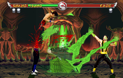
Well I have to be honest w/ you there some few things I like and some few things I don't like...
The names could of been better if they were down not inside the lifebars. The blood eh others times I liked it but this time I don't it looks like pencil lines. I can't really tell who the dead warrior is in fact is it just me or he doesn't have a head? I like the way you use the dead warrior to cut out Cage's head and his head is flying toward Tsung like a ghost.
Gl1tch •06/29/2003 07:30 PM (UTC) •0
I'm also having trouble seeing who the dead warrior is but that's the only thing that bugs me. Everything else is good. especially the blood on the sward.
Keep up the good work like always
Great job 5/5. keep up the good work
~Crow~ •06/30/2003 03:14 AM (UTC) •0
Hmm. Well the idea of this is very original, but there are some things that could have made this better.
The bottom half of the 'dead warrior' sprite looks to bright compared with the top half. It should be darker, or more transparent looking.
I personally don't like how the soul has Cage's head on the end of it. I mean, it looks nice, but I just think it would have been better to go with the more classic formless or orb type soul.
The blood effects are ok, the blood on the sword doesn't look quite right to me.. perhaps too dark. Though this might just be me.
I also noticed you used MKDA lifebars and win tokens. I think it could have added depth if you had tried to edit the sprites to look like the MKDA characters. Not that its necassary, but it would have been nice.
Overall, I like it. It was pretty nicely done.
The dead warrior is Moriya from the Last Blade series. I love this fake 4.5.
I like it

timsmk •07/03/2003 01:20 PM (UTC) •0
Interesting idea.
Anyhow, I quite like it, and here's the "list".
Things that would need changing:
- Shang Tsung's sorcery effects are pretty good. They could be better. I can see 2 or 3 different colours in there, which works quite well, but a little more would make it look a bit better.
- His sorcery effects could also be transparent to a degree.
- The lifebars, i'm not so keen on the mixing together of the lifebars, but hell, it's your choice.
- The names could also be better placed within the lifebars. More towards the centre.
- The "warrior" could perhaps look better a bit more transparent than he is already. This way, it would make him a little less "in your face", you know, bold.
- I think there are some green lighting effects on Shang, but they're not very visible, a little stronger would be better. If there aren't any, then I've been looking at the tv too long, and you could add some, lol.
- The soul is a very good idea, but I think once again, a little more transparency and colours could make it look even better.
- The blood - just a few less "spurts" coming out.
- Is it just me (my eyes again, lol) or are there very small outlines on the sprites (white/grey)? If so, they could be gone.
The good things:
+ The idea is pretty cool.
+ The blood is very good (although perhaps alittle more lines coming off of the main explosion)
+ The shadows, I love the way that the light source is the soul thing in the stage.
Pretty cool pic, keep up the good work.
Moriya??? Why him?
Well, it's a very cool idea! Though, Moriya looks cartoonish, and that's because of his sprite!
© 1998-2025 Shadow Knight Media, LLC. All rights reserved. Mortal Kombat, the dragon logo and all character names are trademarks and copyright of Warner Bros. Entertainment Inc.