Smoke's Return
Smoke's Return
| Artist's Remarks: | |
|
I created this NinjaSuit from scratch, so I decided to make a render of my version of Smoke. This might not fit the Mortal Kombat genre, but I guess it'll do.
|
| Full Scale | 600x595 | Category | Drawings (Digitally coloured) | User Views | |
| User Likes | User Ratings | 44 | Score |
|

0
i think it looks very nice, i dont really have much to say because i dont know much about 3d renders but this looks like a seriously good job, i really like it.
4.5/5
4.5/5
0
That looks very good. Plus it's very realistic. You are one hell of a 3D artist. This Smoke design is great.
PS: Could you make a Noob Saibot 3D render... please ='(! *begs*.
PS: Could you make a Noob Saibot 3D render... please ='(! *begs*.
0
Ditto
Very nice, post starter.
| NoobSaibot Wrote: That looks very good. Plus it's very realistic. You are one hell of a 3D artist. This Smoke design is great.PS: Could you make a Noob Saibot 3D render... please ='(! *begs*. |
Very nice, post starter.


About Me

0
the chains and the symbols are a nice touch,
But the Jesus pose is a lil' too much!
But the Jesus pose is a lil' too much!
this is pretty good, not the best but still a good attempt.
i took a 3d art class in college.
very fuckin hard to get a "hang of"
this is good,
i think the chains look werid and out of place.
but the highlight has to be the hands
they look awsome! very detailed there.
5/10
i took a 3d art class in college.
very fuckin hard to get a "hang of"
this is good,
i think the chains look werid and out of place.
but the highlight has to be the hands
they look awsome! very detailed there.
5/10
0
Fucking sweetness. The only thing I don't like is how he has chains, and the costume is a little plain with only gray. Very nice job on the other hand. I wish I could do shit like that.


About Me
WyattHarris.com Dig it
0
Clothes are incredibly hard to get right in 3D. This is very good. It looks like you added some kinda detail texture but I would make it a little more apparent. Right now it looks too much like plastic. A small bump map will fix that up. Small in pattern I mean, not in amplitude. Beyond that the clothing design is good but basic. Nothing too much beyond the game. Overall it's very nice.
What software are you using to make these?
Wyatt
What software are you using to make these?
Wyatt
About Me
It's time to run away with the sideshow.
Full speed, right ahead.
Don't stop, you can sleep when you're dead."
0
i like it, its very imaginative, but like having a bit of smoke on the bottom might liven it up, just a bit, still excellent
This is nice, reminds me a lot of an early character render such as those found in the krypt in MKDA. I reason I say that mostly is because the gray texture doesn't appear well defined and detailed. It does have that 'plastic' feel that someone mentioned earlier, but the solution to that is probably easy, given your excellent 3D skills. Also, the way the cloth that hangs from his waist blocks out any view through his legs down to his knees gives an odd effect in a way. I think if the legs had been positioned further apart it would have looked a bit nicer.
The skin details are brilliant, you can even see his palm lines which is a very cool detail. The recurring symbol you used is pretty nice, though the design is a bit simple it still looks great. His head looks extremely cool, I love the way you did his eyes. The masks design is good too, because it isn't just a standard 'ninja' design.
The chains are good, but seem like they need to be worked in a little more. They just seems like they connect with his belt, its a different idea but I would like to see the effect given as if they circle around his back. Also, if you want them to hook to the belt, some sort of connector would be a nice addition. As for the stone background, it seems like a pretty nice choice, it accents the character pretty well. The shadow is nice too, but as I look at the shadowing on the body I'm not sure it identifies with them. Anyhow, you have alot of skill, this is a good render overall.

0
Wow, this is nice. It looks pretty realistic! Cool
Oh my sweet Moses!
Let me start out by saying that his hand is incredibly perfect! It looks really...uh...real.
I love the mask design. It's really original and very cool looking.
The chains dont really serve a purpose. Infact, they look like they would just get in the way.
The render does indeed suffer from some sort of plastic-effect. Looks like an action figure, specially the cloth.
The backround is pretty cool, a stone wall. kinda looks like he got cornered by enemies, now he turns around to woop some ass.
I really dont like that symbol. You should've used the Lin Kuei symbol that was in Mortal Kombat Conquest. That was a pretty cool symbol.
Overall, 4.5 from me. This defenetly beats the Lou Kang design (which I hated, btw).
0
Looks awesome. Though needs 2 things. Well 3.
1: some short of a texture on the GI.
2: the chains need to be modded just a bit to make them look like there apart of the outfit
3: Smoke....
1: some short of a texture on the GI.
2: the chains need to be modded just a bit to make them look like there apart of the outfit
3: Smoke....
0
I'm going to give this 4.5 out of 5 Dragon Points. I like the whole 3D render look and the mask and symbol designs, but I think the chains are unnecessary and the sash thingy is a bit too long. Other than that, I really like it. 


About Me
Join the Mortal Kombat Odyssey http://mkodyssey.net/
0
wow that looks almost real! I thought it was a real pic dude!Amazing, very, very nice work in that aspect. Now in the costume aspect well... It looks very nice, I don't like the chains, and does that symbol has any particular meaning? The mask is very orignal!
COngrats again! btw I suppose you created your avatar too right?
COngrats again!
About Me
0
Thats amazing  Lets see more!
About Me


-- choose your destiny --
0
Well fuck me.
That image is so damn 1337 i'm lost for words. And I LOVE that logo you added to his uniform...that makes him look like ub3r 1337 man, good stuff!
Regards,
That image is so damn 1337 i'm lost for words. And I LOVE that logo you added to his uniform...that makes him look like ub3r 1337 man, good stuff!
Regards,


About Me

Join the Mortal Kombat Odyssey http://mkodyssey.net/
0
Yeah! I'd like to see how Sonya would look with your skills!
0
It's alright.. add more detail..
Seriously...this is one of a few topics I've seen you dig up from as far back as 2 years ago. Necro-posting is usually frowned upon, and is just generally annoying as hell.
I'm sure you just want your opinion heard on certain topics....but do yourself a favor and stick to the more recent ones.
I'm sure you just want your opinion heard on certain topics....but do yourself a favor and stick to the more recent ones.
0
& ur gay :D


About Me
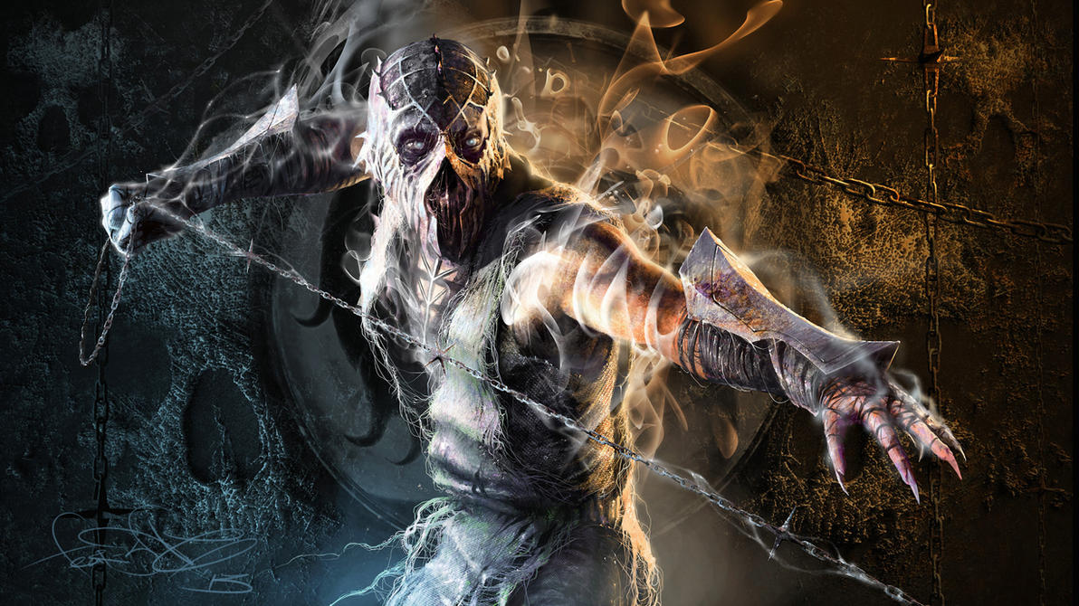 art by fear-sAs
0
If you can't say anything constructive about the drawings, and have to resort to down talking other members, you don't belong here.
0
zerodegreeze Wrote:
& ur gay :D
& ur gay :D
Takes one to know one.
That's all I have to say.
© 1998-2026 Shadow Knight Media, LLC. All rights reserved. Mortal Kombat, the dragon logo and all character names are trademarks and copyright of Warner Bros. Entertainment Inc.


