scorpion fatality
Fan Kreations
Pages: 1
scorpion fatality
Display Mature Content:


| Artist's Remarks: | |
|
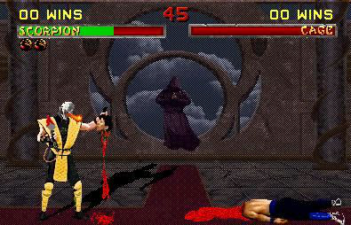
ok i like this one a lot, its kind of a modification of his MKDA fatality, he spears there head, but instead of just pulling it off he pulls it to him, and then pulls off his mask and toasty there head, heh.
|
| Full Scale | 395x254 | Category | Fakes | User Views | |
| User Likes | User Ratings | 8 | Score |
|
0
0
MMMMM.. neat concept even thihg the fire from scorpions mouth kinda uh.. well looks odd, but thats probly because the fatality is still in progress. Other than that I think it looks good and well done.
0
The Jpegness ruined your fake pic a lot  . The way you darken the screen, and added shadows and added WINS are good, normally people don't bother adding this things which makes your pic look to fake, but you try to make it convising, good job. You didn't bother to fix the transparency problems which both sprites are missing white here and there. The spear looks like 1 color; heh I bet you got the idea from me because I also did something similar in my fake. I don't like the blood its just from the MKWarehouse so no actual editing yourself.
Overall its not bad, I could see what direction your already going, so take your time and gather all this feedback into 1 and if you have patients and never give up on your work yur going to be a become a good fake pic maker
Overall its not bad, I could see what direction your already going, so take your time and gather all this feedback into 1 and if you have patients and never give up on your work yur going to be a become a good fake pic maker

0
uhh i did all the blood by myself exept for the puddle under johnys head, and the spear is from mk ware house as a prop, thanks for the advice unbeatable, i need alot, i still have no idea what im doing lol.
Gah, dreadful.
I'll list the good and the bad stuff, TimsMK style.
Good stuff:
- The Scorpion sprite edit is KINDA ok. So I guess it's a good thing. I guess.
Bad stuff:
- You're a lazy ass, you didn't take out the transparency in Johnny Cage and Scorpion's sprites.
- The darkening effect. OK, so all you got is Paint, but I would honestly prefer seeing an intact backround then this terribly ''darkened'' version.
- The fatality idea. A bit overused.
- The blood puddle coming out of Cage's body isn't exactly super fantastic.
Zero dragons, for effort.

0
ahhh 3 zeroes so refreshing.
Dont worry, as life goes on not everyone will love your work. As long as "you" are proud of your masterpiece then who cares what others say, right? I mean theres a lot of bad critics out there. For example, some critics said "Titanic" was a great movie. They can eat a bag of dicks, those are the same assholes who pissed all over "Dumb and Dumber" and "The Matrix Reloaded". Giving credit to movies that sucked cock and critizing movies that were funny and great in the media's eyes(The normal media, not those fags who love shitty bands like Good Charlotte or Fifty Cent), whata load of shit!... great work though, Ill give you a five for effort, its different from what I see on this board.

0
Odd i agree with everything u said lol. I think were related 
Well, this isn't bad, it's better than the other one I think. The idea may be slightly uninspired, but I doubt many people working on their second fakes are going to wow us with some hugely original idea. Anyway, you put in most of the basic things, though the jpg does cause problems in some areas. The shadows you did look pretty good, I like how you even did one for Cage's head. You took some life away from Scorpion, good touch. Whether the BG looks bad or not, you did darken it correctly. Perhaps in a bitmap or png format it would look a little better. Win tokens are there as well. You have all the basic things every fake needs now, which is good just to be your second fake.
Ok, Scorpion's head does look a bit blurry, for obvious reasons of course. But I think placing the fireball closer to making the impact with Cage's head would have been better. The look on Cage's face isn't very good though, he's already had his head ripped off so he should have a lifeless look on his face. The rest of the work with the head is decent though, perhaps the blood is a bit too dark in a few areas, but overall its alright. A few things though: one, the largest area of blood dripping of the neck could use some work. Just seems to large of an area I think, an it isn't exactly formed as blood would be that is falling like that. Also, on the arena floor, the blood doesn't seem it is 'splattering' enough to me, but its so bad. The spear does look like it is a solid color at first glance, but upon further review I discovered it isn't. The blood on the spear could be better though, it looks sort of flat, like red paint. You should have it sort of running down the spear I think, better to show the blood is liquid and is moving.
Ok, Cage's feet are of course bad, the transparenct should be fixed. The blood flowing out of the open wound isn't that good really, not that horrible though. It looks a bit 'outlined' around the outer edges to me though. But, I do see some actual work and editing, you didn't just throw a bunch of sprites together and call it a fake. Hope to see you improve again on your next fake, keep it up.
0
| Zentile Wrote: I'll list the good and the bad stuff, TimsMK style. |
You cannot match my style
Ok, here are the things that are forgotten/need work etc.
- Why is Scorpion's lifebar upside down? Just curious, as the lighter bit of the bar is on the bottom.
- Scorpion's win counter should've increased to "01 Wins" at least, as he has just (clearly
- Johnny's feet have that transparency problem on them. It's very easy to fix, just change the background to something else before you remove it.
- The shape of the blood pool by Johnny's head, it could be better. It kind of goes in one line, which isn't too good, liquid spreads out on the floor. You can even go and try it yourself
- Timer two pixels to the left please
Good things:
+ Well, Scorpion isn't highly edited, but still, adding the skull onto him, doesn't look too bad (doesn't ruin the sprite).
+ The blood drop is pretty decent.
+ I like your idea with the spear. However, as you can tell, the spear's graphic was not very impressive in MK2 (the actual "dagger" part), so you could've improved it, made it looked more metalic.
+ Shadow is there.
The thing is the idea has been done before in animations, and other fake pics, and nothing exciting is really going on. Even if Scorpion is about to flame his head, we don't see it. If you had've had Scorpion flaming his head in the actual pic (i.e. a full fire effect), then it may have been more exciting, but, still.
Pages: 1
© 1998-2024 Shadow Knight Media, LLC. All rights reserved. Mortal Kombat, the dragon logo and all character names are trademarks and copyright of Warner Bros. Entertainment Inc.


