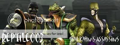
Reptile Paint
Fan Kreations
Pages: 1
Reptile Paint
| Artist's Remarks: | |
|
I made this in Ms paint in about 10 minutes. There are some crappy parts i know but oh well..... i like it lol
|
| Full Scale | 962x716 | Category | Drawings (Digitally coloured) | User Views | |
| User Likes | User Ratings | 8 | Score |
|
0
Nothing personal but...its gets -2/5 I i told you how to post cuz i was hoping you'd put somthin a lil better up y dont you go to MK warehouse an copy some sprites off there to make somthin better.......oh and if you decide to post more of stuff like that try to keep it on 1 post limit the damage......lol
About Me


0
Oh and you didnt tell me how to post kombat did. And this is ms paint..... you need to lighten up..
i dont wanna do mk warehouse stuff cuz i dont care.... i just wanted to post this cuz it was a little thing i made in paint

i dont wanna do mk warehouse stuff cuz i dont care.... i just wanted to post this cuz it was a little thing i made in paint
0
I think its pretty darn accurate to the movie costume.
0
ThaReal Wrote:
Nothing personal but...its gets -2/5 I i told you how to post cuz i was hoping you'd put somthin a lil better up y dont you go to MK warehouse an copy some sprites off there to make somthin better.......oh and if you decide to post more of stuff like that try to keep it on 1 post limit the damage......lol
Nothing personal but...its gets -2/5 I i told you how to post cuz i was hoping you'd put somthin a lil better up y dont you go to MK warehouse an copy some sprites off there to make somthin better.......oh and if you decide to post more of stuff like that try to keep it on 1 post limit the damage......lol
Why are you telling him how to draw? So far his pictures have been cute and accurate.
I like this picture of Reptile. I've always liked his mask in the movie. I give you 4 pts out of 5!
CHEERS!
About Me


0
I made some more updated ninja ones that are decent.. go look at em when they appear on forums!!
0
Well, I have to admit, the mask looks okay, but that's really it. The designs on the mask aren't symmetrical, Reptile's arms and hands are scrawny, and he looks lop-sided to his left. I'm sure you wanted it to look like he's turned more to the left side, but it doesn't look like his body is turned around because there's no ruffling or shadows on his clothes to indicate that he's actually moved. Another thing is why did you leave so much white on the submission? That should've been removed.
This is one of your better pieces, but that isn't saying much.
This is one of your better pieces, but that isn't saying much.
Pages: 1
© 1998-2025 Shadow Knight Media, LLC. All rights reserved. Mortal Kombat, the dragon logo and all character names are trademarks and copyright of Warner Bros. Entertainment Inc.


