Reptile Design Color
Reptile Design Color
| Artist's Remarks: | |
|
Here is the colored version of my reptile design. ***Please comment if you rate!! Thank you!
|
| Full Scale | 1253x1657 | Category | Drawings (Digitally coloured) | User Views | |
| User Likes | User Ratings | 18 | Score |
|
0
0
Null


0
You have a knack for making Reptile look like an "important" character, like...this outfit feels to me like it the only way it could work is if his story had something as awesome and triumphant happening to him as when Sub-Zero became Lin Kuei Grandmaster and then got the cryomancer armor.
0
Awesome. Looks really good. ^^

About Me
0
Thank you all very much!


About Me
Mortal Klaybat #1 - Shinnok, Shao Kahn, Sektor, Noob Saibot and Ermac! 
0
I'M REALLY MAD AT YOU. Why don't you work at NRS?!
10/5...Again.
10/5...Again.

About Me
 gamertag: jeeringjunk
0
perfect 10/10
About Me

0
Reptile brings back his race and leads them. This costume could work for that purpose since it looks like a "leader" type costume.
5/5
Although I am still on the fence whether or not I like the feet. I am leaning more towards a like seeing it in color.
5/5
Although I am still on the fence whether or not I like the feet. I am leaning more towards a like seeing it in color.


About Me
hey
0
SWEET! I really wish he looked more like that in MK9, it's so much better. I love that cobra-like hood!


About Me
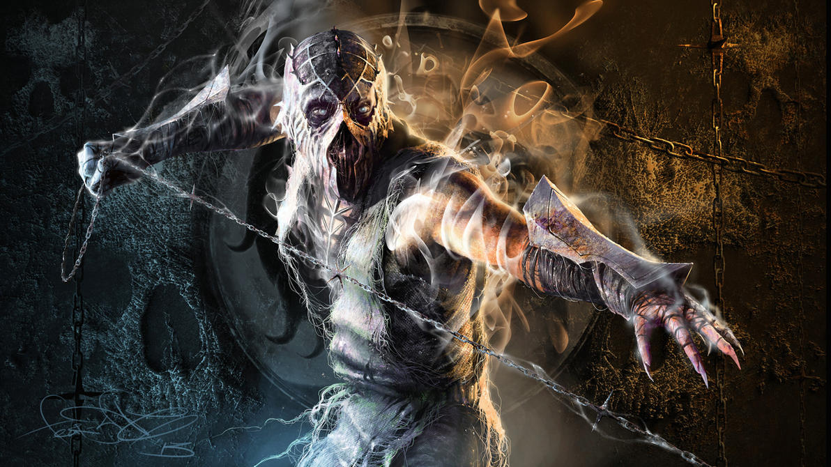 art by fear-sAs
0
Great colors. Have a question though. What would the back of his design look like? I kind of feel like that the back shot is missing from these kinds of pictures where people design new looks for the characters.


About Me

0
The feet and tail look great. I love this design, not much else I can say.

0
*gulp*
This design brought a tear to my eye, it's perfect. Best Reptile design I've ever seen in my life. I would pay 1600mp for this one costume right now, great work!!!!
This design brought a tear to my eye, it's perfect. Best Reptile design I've ever seen in my life. I would pay 1600mp for this one costume right now, great work!!!!


About Me
0
-Brad- Wrote:
Coloring is just as good as always.
This really is a great look for Reptile, I'm picking up a Pharaoh vibe from it, which I like.
Coloring is just as good as always.
This really is a great look for Reptile, I'm picking up a Pharaoh vibe from it, which I like.
Yeah, I wanted to give him a bit of Egyptian royalty to him and see if any one would notice.
SmokeNc-017 Wrote:
Great colors. Have a question though. What would the back of his design look like? I kind of feel like that the back shot is missing from these kinds of pictures where people design new looks for the characters.
Great colors. Have a question though. What would the back of his design look like? I kind of feel like that the back shot is missing from these kinds of pictures where people design new looks for the characters.
The back would look just like the front except for the loincloth, its a tattered piece of cloth.


About Me
0
Reptile would kickass if he looked like this in the game.
Seriously NRS needs you. And Razor for the story.
Combined you two could be unstoppable.
Seriously NRS needs you. And Razor for the story.
Combined you two could be unstoppable.


About Me
0
Thank you very much!
If any of you want to show Ed or any of the team this go ahead. I'd like to here what they think.
If any of you want to show Ed or any of the team this go ahead. I'd like to here what they think.
About Me
http://fatality-check.deviantart.com/
0
Man. I really love this design. Love the detail and you've got the pose done really well. Only thing I'm not so sure with are some of the colours and the painting in general. I think if you worked on your painting more, or if you would have spent more time on it in that area it would look a lot better. To give an example, the shoulder pads have refection on them, but its not very readable because it's just a couple of blobs.
Lover everything else though :)
Lover everything else though :)


About Me
0
thank you! I was tring to give the effect of 2 spot lights on the shouler pads, but what do you mean spend time painting on? you didnt really specify except for the shoulderpads.
About Me
http://fatality-check.deviantart.com/
0
What I mean by spending more time with painting is using more value, helping to define your materiel's and light source etc. light source doesn't matter as much because it's a concept so that's cool. Kinda hard to explain really, sorry lol
© 1998-2025 Shadow Knight Media, LLC. All rights reserved. Mortal Kombat, the dragon logo and all character names are trademarks and copyright of Warner Bros. Entertainment Inc.

