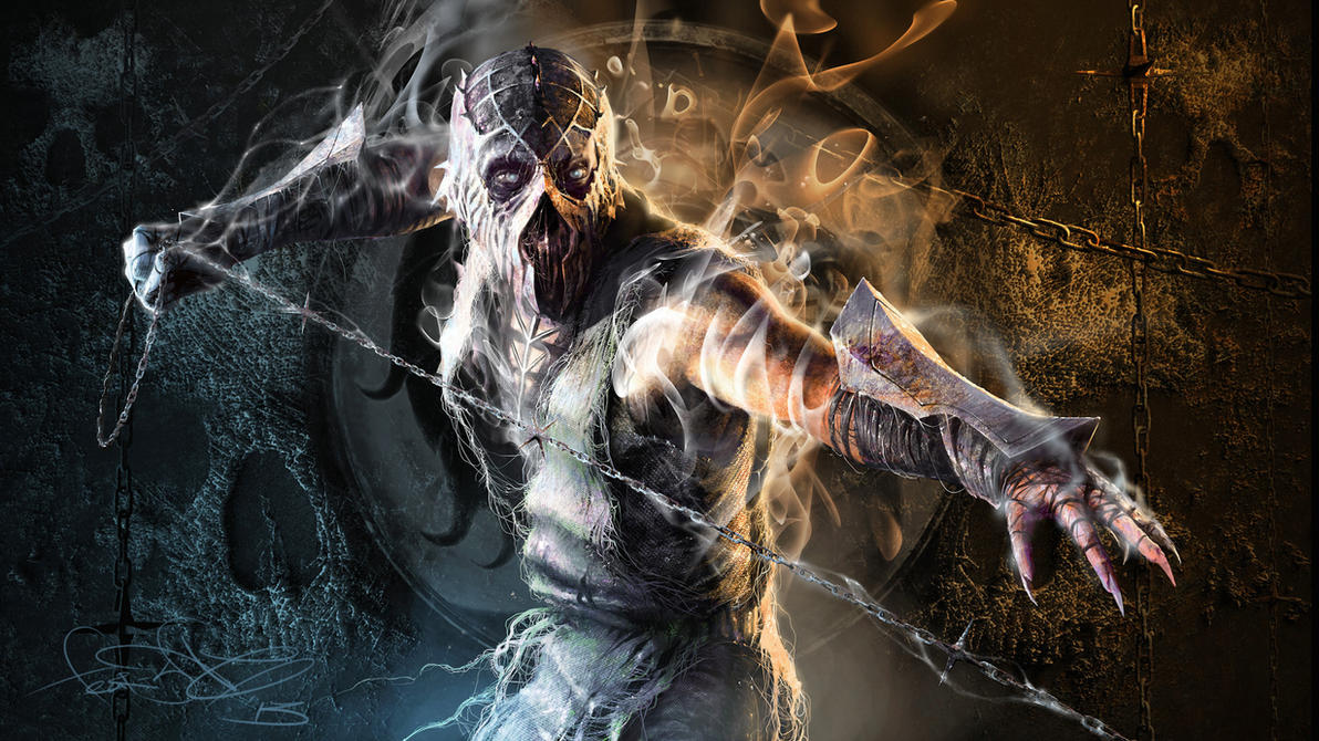
noob-smoke fake
Fan Kreations
Pages: 1
noob-smoke fake
| Artist's Remarks: | |
|
Just updating my gallary.. -Foot
|
| Full Scale | 395x254 | Category | Drawings (Digitally coloured) | User Views | |
| User Likes | User Ratings | 4 | Score |
|
0


About Me
 art by fear-sAs
0
I like this fake. Noob looks like he has his MK4 appearance, and Smoke looks nicely done. I'm fond of the smoke trail around his body. Nice job.
0
Smoke's shadow would not cast on the bridge, it would cast on the ground below and that's it. Also, a hint of Noob and Raiden's shadows both extend past the edge of the bridge, so parts of the side are more visible than the rest. The side of the bridge should have a constant shadow because it's completely unexposed to a lightsource of any kind. Raiden's hands are white. The clouds don't mesh well with the moon, which may just be the background, but I don't know. You can see the spot I'm talking about. The icons are a little scrunched but I understand you had to make room for Smoke. The counter is one dimensional and stands out a bit much. Maybe try blurring the layer once so it meshes well with the lifebars. Overall it's a lovely concept and a good execution, I'm just noting what you could fix to make it techinically more correct.
All I can say is THANK GOD!
Someone FINALLY made a pit1 fake without using that awful mkwharehouse pit1 background with the retarded mk dragon superimposed over the moon.
I guess there is still hope for this forum's aspiring artists yet :)
Someone FINALLY made a pit1 fake without using that awful mkwharehouse pit1 background with the retarded mk dragon superimposed over the moon.
I guess there is still hope for this forum's aspiring artists yet :)


About Me
<img src ="http://www.comixodez.com/Sets/mkosig2.png"
www.ComiXodeZ.com
0
I
I wouldn't be so technical of the shadows, its not that bad. They don't take away from the fake (which is the whole point). I do have problems with the background clouds where its messed up at. The numbers aren't MK font. The smoke on Smoke doesn't have to streak (that takes away from the fake). It was just too emphasized. I don't know why you didn't just use the Noob/Smoke icon instead of using Scorp and Sub (that wasn't smart). The sprites themselves aren't all that great, but you are making progress. Good job overall.
FatalTragedy Wrote:
Smoke's shadow would not cast on the bridge, it would cast on the ground below and that's it. Also, a hint of Noob and Raiden's shadows both extend past the edge of the bridge, so parts of the side are more visible than the rest. The side of the bridge should have a constant shadow because it's completely unexposed to a lightsource of any kind. Raiden's hands are white. The clouds don't mesh well with the moon, which may just be the background, but I don't know. You can see the spot I'm talking about. The icons are a little scrunched but I understand you had to make room for Smoke. The counter is one dimensional and stands out a bit much. Maybe try blurring the layer once so it meshes well with the lifebars. Overall it's a lovely concept and a good execution, I'm just noting what you could fix to make it techinically more correct.
Smoke's shadow would not cast on the bridge, it would cast on the ground below and that's it. Also, a hint of Noob and Raiden's shadows both extend past the edge of the bridge, so parts of the side are more visible than the rest. The side of the bridge should have a constant shadow because it's completely unexposed to a lightsource of any kind. Raiden's hands are white. The clouds don't mesh well with the moon, which may just be the background, but I don't know. You can see the spot I'm talking about. The icons are a little scrunched but I understand you had to make room for Smoke. The counter is one dimensional and stands out a bit much. Maybe try blurring the layer once so it meshes well with the lifebars. Overall it's a lovely concept and a good execution, I'm just noting what you could fix to make it techinically more correct.
I wouldn't be so technical of the shadows, its not that bad. They don't take away from the fake (which is the whole point). I do have problems with the background clouds where its messed up at. The numbers aren't MK font. The smoke on Smoke doesn't have to streak (that takes away from the fake). It was just too emphasized. I don't know why you didn't just use the Noob/Smoke icon instead of using Scorp and Sub (that wasn't smart). The sprites themselves aren't all that great, but you are making progress. Good job overall.
About Me
www.mknexusonline.com MK Nexus Online
0
Foot,this is another of your Cool fakes.another 10\10 for awesomeness!
Pages: 1
© 1998-2025 Shadow Knight Media, LLC. All rights reserved. Mortal Kombat, the dragon logo and all character names are trademarks and copyright of Warner Bros. Entertainment Inc.


