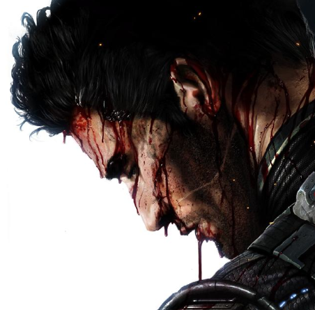
MKD Ermac
Fan Kreations
Pages: 1
MKD Ermac
| Artist's Remarks: | |
|
I didn't spend 100 hours on this, but since I don't particularly like Ermac alot to begin with, I think I did pretty well. :p
|
| Full Scale | 569x720 | Category | Drawings (Digitally coloured) | User Views | |
| User Likes | User Ratings | 18 | Score |
|
0
submitted 06/10/2004 06:45 PM (UTC)by The-Switcher


About Me
The Introduction To Destruction
Member Since
09/06/2002 10:27 PM (UTC)
Pretty good. The coloring looks great. I think the green myst around his hand would look better without the outline, the outline makes it look flat.
Also, It would have been cooler if you tried to come up with a more original pose since this is basicly his character select render pose. Still, this is great art.
Also, It would have been cooler if you tried to come up with a more original pose since this is basicly his character select render pose. Still, this is great art.
0
Awesome but not 5/5....
It is a fine piece, but this isn't your best in my view. As mentioned, the pose is a bit uninspired. I don't see much difference, if any, from the select screen shot of Ermac in MKD. It does seem you captured it quite well though, as far as the design goes.
The colouring is my main issue with this, though. It's just far too bright, and almost cartoonish in feel. The chest area seems a bit flat and lifeless, to me. The lighting looks to be a bit off in places as well. The flame is just too standard for me, it just seems like it isn't burning with any rage to me. Ermac is a character who should radiate a lot of anguish, and it just seems to lack this. For me, I just see him "holding" this flame, not producing it out of any form of pain. I suppose this is because its a copy of the select screen pose, but I would have liked to see you add your own touches on the character. Doing so, I believe we could see more feeling behind it.
Another addition you could have made yourself would have been to do a full body drawing. Again, this would have given you the chance to add your own spirit to this drawing. Overall, its alright, but could have been much better.


About Me
I Have Become as the Wastelands of Unending Nothingness. Now Shall the Night Things Fill Me with their Whisperings, and the Shadows Reveal their Wisdom.
0
I agree completely with JAX007 and ~Crow~. It's a great job, but not your best. It really is pretty uninspired. Ermac is shaping up to be one of my MKD favs, partly because of his styles and weapon; they give him a very interesting feel, from what I've seen. I was hoping a great artist like you would capture some of that, but this is just his select screen pose; with most of your work I really feel it, but not here. It's good from a technical standpoint (although his right hand seems to lack detail) but it doesn't have the energy I was hoping for.


About Me
The Introduction To Destruction
0
Thanks everyone, especially you Jax and Spoon...I was starting to think you guys were purposely avoiding my threads. Glad to see that's not that case. :p
I agree, especially with the original pose thing. I tried a few poses, but his head kept coming out mishapen. So I just stuck with a very slight modification of the select screen render. I changed his fist, along with the head, made it meaner and more ragged looking, but the general pose is the same.
While I like some elements of Ermac's design, his overall personality and character is boring. Especially since now he seems to be a carbon copy of Kenshi, special move wise.
I'm just a sucker for bandage-faces, I guess. :p
Therefore, the only part I really like is his head, the rest I couldn't muster the energy to make it more interesting.
I'll keep trying though! ^_^
0
Well, I had been purposefully avoiding your threads ^_^ *points* That's Crow, dear. He stole my avatar and never gave it back XDDDD
You still need to work on your lighting consistency; you never do bother much with that. Where is the light source that's on his left shoulder and the top of his head? Serious, the brightness you gave that flame, you should have washed everything else out in black; that would have been SEXY. O_O
What's wrong with you?! You don't think Ermac can be sexy?~!!?!?!!?!?!@@!?#@!>#!>@#?!>oneoneoneoneatatattildetilde


About Me
The Introduction To Destruction
0
Aaaa...why were you avoiding them? I commented in some of yours and Jaxes...
Ah well, no biggie.
Yeah, the more I look at it, the more I was dazed and confused with the light source. I thought I had worked through that, especially the MKD Subby I did a while ago, but I threw it all away here. :p The whole washing out almost everything in black would have worked well. I took it back into photo shop, but it doesn't work all that well now that it's all merged in a finished drawing.
I'll keep that in mind next time. Thankies. ^_-
0
Babe, if you've got the harddrive space, save the PSDs. It's saved me loads of headaches o_o

0
Very Very nice. Make a Subby and a Scopion. The whole cartoon effect will look cool as hell with those two!


About Me
WyattHarris.com Dig it
0
Well, I can't recall that select screen so this is pretty unbiased.
Most points have already been touched on so I'll mostly say I think it's alright. I like what you were doing with the lighting on his body only some parts don't match up. It would light more of the front of his face along with the side. The chest area probably would recieve more light as well.
I can't recall what Ermac is wearing (I don't care much for him either), but the texture here gives it a nice polished leather look.
Take it easy
Wyatt
0
Well I give this one bandanged thumb up. Yeah the flame lighting seems to have no effect on the rest of the picture. Also his right arm seems to be a smaller than his left (I'm talking about from my PoV, so his left is my right). Of course its not bad, and you do have a reputation of doing good stuff, so you get the thumbs up, but not a clean one. His waist is a little too big too. Of course I don't do MK stuff anymore, so I should backup my own words someday.
Pages: 1
© 1998-2026 Shadow Knight Media, LLC. All rights reserved. Mortal Kombat, the dragon logo and all character names are trademarks and copyright of Warner Bros. Entertainment Inc.


