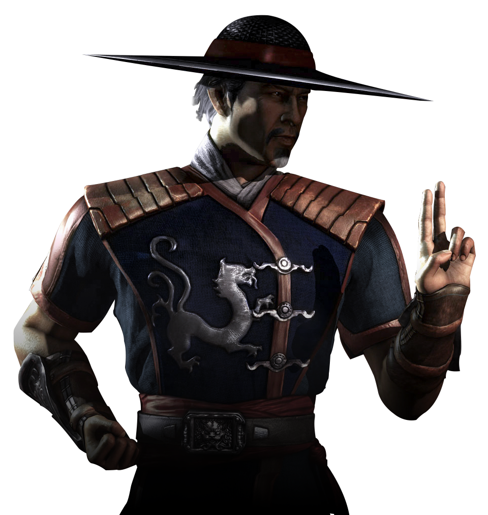
MK6 subboss Oni Torcherer
Fan Kreations
Pages: 1
MK6 subboss Oni Torcherer
| Artist's Remarks: | |
|
He's just as big as Moloch, but stronger of course. I named him Zao Ruk, cuz it sounds kool, anyway I just felt like drawing an oni demon that i think would look tight for MK6. he has a ball and chain attached to his arm, keeping the oni traditional feel.
|
| Full Scale | 738x684 | Category | Drawing (Fan character) | User Views | |
| User Likes | User Ratings | 8 | Score |
|
0
About Me
-
0
I think that the general idea is alright but some aspects of the picture aren't all that appealing to me. Firstly overall he looks like some troll regect. Like the idea of having the chain attached to the stump was interesting but unoriginal. And lastly the majority of the picture looks cartoonish save some of the muscle structure. I'll give you some points for effort, but overall it's not that good of a pic work on you're anatomy more aswell as detail. Try to avoid drawing elements that would make it look cartoonish, add some shading and you're ratings will gradually increase.

0
intresting, looks like a combo of goro, motaro, and moloch to me....
I'm not so sure I like this. I'm not sure if you misspelled that word on purpose or not, anyhow, I suppose its not too important. Like someone mentioned, this does remind me of a combonation of Goro, Motaro, and Moloch. I like the head, it looks pretty good for the most part, but his hairstyle should be different or he should have no hair at all. This looks too much like Goro's hair to me. The missing hand replaced by a ball and chain is a decent idea, but I would have liked it more if it were some other weapon there. Drahmin's and Moloch's weapons differ, so why not this one? Also, that 'chain' thats running over his arm needs more detail, as it looks like a bunch of little circles to me.
You did do a good job with drawing the chest, but the legs just sort of don't go with this in my opinion. They are very reminding of Motaro's, and they also look a bit thin to be able to hold up such a massive creature you described. Not saying they are drawn bad, but I would have liked to see something a little more original. Not too bad really, I like how you added a fatality in the corner, nice touch.
You did do a good job with drawing the chest, but the legs just sort of don't go with this in my opinion. They are very reminding of Motaro's, and they also look a bit thin to be able to hold up such a massive creature you described. Not saying they are drawn bad, but I would have liked to see something a little more original. Not too bad really, I like how you added a fatality in the corner, nice touch.


About Me
 i wish i had something cool to say
0
it looks somewhat like you intended to spend more time on it than you actually did. the chest looks nice, the head is off center and cartoonish, and it looks like you ran out of room to put the legs so you just used the space you had and crunched it all together.i do like the animation of the fatality on the side. that is very nice. as for the ball and chain, i see what you're going for but it needs a better way to be attached. a hole through his arm makes it look cartoonish. maybe if it were kind of hacked away with a metal base around his arm or something.
Pages: 1
© 1998-2025 Shadow Knight Media, LLC. All rights reserved. Mortal Kombat, the dragon logo and all character names are trademarks and copyright of Warner Bros. Entertainment Inc.


