MK1 Remake Concept - Liu Kang
Fan Kreations
Pages: 1
MK1 Remake Concept - Liu Kang
| Artist's Remarks: | |
|
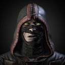
I figure, in every other game he's ever been in, he wore the exact same red and black pants with the headband. Since MK1 is the only time he appeared different, I ought to preserve it. Plus, it makes him look a little more humble to be dressed so simply, I think. The background is the same location they used for the Shaolin Temples in the movie, and I put a gold dragon behind his name as a reference to his destiny as Champion of Mortal Kombat.
|
| Full Scale | 600x750 | Category | Drawings (Digitally coloured) | User Views | |
| User Likes | User Ratings | 11 | Score |
|
0


About Me

0
Very good job!
But you're wrong about one thing. He hasn't looked the same through every game. He looked different in his MK4 alternate, and in his MKD Primary.
But you're wrong about one thing. He hasn't looked the same through every game. He looked different in his MK4 alternate, and in his MKD Primary.


About Me
"Thou Shalt not Test the Lord's own Code"
0
HAY! It's Jacky Chan from Jacky Chan's Adventures!!! WOW!
I don't like the Liu, whom I believe to be Jacky Chan in Liu clothes. But the dragon and text I really like so I votes high.
I don't like the Liu, whom I believe to be Jacky Chan in Liu clothes. But the dragon and text I really like so I votes high.


0
Becoming a zombie does not count as a change of clothes, sir. Unless you're referring to Ghost-Liu, who inexplicably has a new pair of pants.


About Me

0
Liu Kang's face is smooth not got that many wrinkle's on it.I really don't like the attire you should have given him these pant's.

This should be his correct attire because you're pant's look really bland and not really sophisticated.I think you have done his muscle well though you have put great effort into that it looks quite cool.Overall I rate this submission 2.5/5
owen_pwned

This should be his correct attire because you're pant's look really bland and not really sophisticated.I think you have done his muscle well though you have put great effort into that it looks quite cool.Overall I rate this submission 2.5/5
owen_pwned


0
owen_pwned Wrote:
Liu Kang's face is smooth not got that many wrinkle's on it.I really don't like the attire you should have given him these pant's.

This should be his correct attire because you're pant's look really bland and not really sophisticated.I think you have done his muscle well though you have put great effort into that it looks quite cool.Overall I rate this submission 2.5/5
owen_pwned
Liu Kang's face is smooth not got that many wrinkle's on it.I really don't like the attire you should have given him these pant's.

This should be his correct attire because you're pant's look really bland and not really sophisticated.I think you have done his muscle well though you have put great effort into that it looks quite cool.Overall I rate this submission 2.5/5
owen_pwned
...You realize that's a picture of Reptile, right? And that I said I WANTED his pants to be bland, because a simple monk wouldn't wear fancy things?


About Me

0
Sorry about the Reptile pic my photo bucket messes up.


About Me
Why don't you have a seat?
0
Woah.
5/5
5/5


0
Pretty good 4/5
<3
<3
Pages: 1
© 1998-2025 Shadow Knight Media, LLC. All rights reserved. Mortal Kombat, the dragon logo and all character names are trademarks and copyright of Warner Bros. Entertainment Inc.


