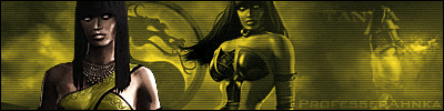
MK Armageddomn character select screen
Artist's Remarks: | |
This is a concept that I put together as to how I would like to see the character selection screen in MKA look. A big thanks to Ace Kombat for adding the scratches on the face plate and for fine tuning the Shao Kahn model.
|
Full Scale | 936x626 | Category | Drawings (Digitally coloured) | User Views | |
User Likes | User Ratings | 31 | Score |
|
0
About Me
0
looks cool.. 4/5

0
Nice job
0
I would love to see the screen like that in MKA


About Me
0
That's a very nice concept of the character select screen. So many choices to choose from... 5/5
0
This is probably the best fake you've made, looks great imo.
Spoilers: (Highlight to reveal)
Sorry for the bump, I usually dont bump threads but this is pretty good compared to his other work lately.


About Me

0
The pictures are really really ugly and slapped on lazily, but I like the concept, and gave it 2/5. Rain could be touched up, and Onaga is stretched to shit, though.
0
An updated version with These would look alot better.


0
oh god, its just so overwhelming to look at pre MKA stuff. Its hard to relive that major hype, only to know it would turn into disapointment. But let me time travel back to jan 06:
4/5!
4/5!


About Me
0
If I'm allowed to chip in with an opinion on a thread this old..
...this is EXACTLY what people are talking about when they say stop pumping out 'shitty fakes'. The character boxes look REALLY out of proportion, there's no consistency in their sizes.
Second of all, the selecting boxes are a weird setup, it kinda confuses me as to which character's been selected.
And the background really isn't much cop. It's an Onaga render with some random fire effect generated from a 3D program that you obviously didn't create.
Don't even expect a rating, this is just what I think.

0
Well I think you're full of it Stone. Thx for comments


About Me
I need a new sig picture....
0
not bad, but i despise the dark raiden. anyway 4.8/5


About Me
0
That's cool.
Enjoy your skull point, and let's hope this maybe teaches you a lesson to stop being so full of your own fucking piss and importance, m'kay?

0
Please grow a pair, if that's even still possible for you
0
I like it except for the brackets that are around the selected character. 3/5
© 1998-2025 Shadow Knight Media, LLC. All rights reserved. Mortal Kombat, the dragon logo and all character names are trademarks and copyright of Warner Bros. Entertainment Inc.