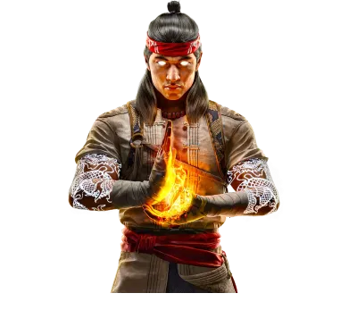
I like this picture a lot. The coloring is pretty good in my opinion. It still is kind of "flat" I would say, but I do like the colors chosen and the minor shading that I see. The only real problem that I see, and this is only my opinion, is that it should have been "darker". Kabal is very mysterious and dark, which should reflect in his appearance. Lots of shading would accomplish that.
Other than that, I gave you 4/5 and keep up the good work.
Cool coloring but still too pale, too flat. You should apply some shadows. But it's pretty good.
4.5/5 Dragon Points.
ok since i too colored this pic and posted here,
compare mine and yours.
the shirt and pants on yours is flate, its colored with ONE solid color, theres no lights anbd darks, choose more shades of the color to give it depth. light middle dark,
hope this helps.
the character concept was nicely drawn. The outfit could have used a bit more details. It looks to plain. The coloring seems too light for this character. Needs something rich in color. His arms werent drawn that well speacially the one on my right. It looks odd. The face could have used more detail and could have been more disfigured. 4/5
Ditto my comments from the Sonya pic and Zombie's. Way to flat and subtle. Each region has only one color. I believe Jax's drawing is what is making this look good. What would this look like if you didn't use one of Jax's pictures to start.
Wyatt
© 1998-2025 Shadow Knight Media, LLC. All rights reserved. Mortal Kombat, the dragon logo and all character names are trademarks and copyright of Warner Bros. Entertainment Inc.