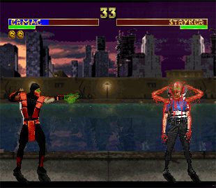
Ermac's telekinetic powers
Fan Kreations
Pages: 1
Ermac's telekinetic powers
Display Mature Content:


| Artist's Remarks: | |
|
Ermac uses his telekinetic powers to make Stryker's skeleton rip out of his body.
|
| Full Scale | 310x271 | Category | Fakes | User Views | |
| User Likes | User Ratings | 8 | Score |
|
0
0
Wow very nice job, but...
I never really liked that Dark Ermac sprite for some reason =/
Add WINS on top of the lifebars
The texts are Mk2 fonts, since your using mk3 Lifebars then you should use mk3 text aswell.
Darken the screem
Every thing else is cool and very original expecially how the Skeleton is coming out, it reminds me of a fake I made w/ the same idea your trying to use. Although the green around Striker looks a bit weird also there should be green around the skeleton since Ermac is using his powers.
Overall is good like always
This is pretty nice looking. But I don't like the screen size, its too small, width should be longer than this. Shadows are nice, and you have the win tokens there as well. BG should dim for the fatality though, its just a small detail in itself though. Stryker's name looks a bit 'blurry' to me, I'm not sure if its the jpg, or it just looks that way.
I do like Ermac, especially the little edit with his eyes, nice touch. The effects on his hand are so-so, the green doesn't 'glow' enough in my opinion. The effect around his head it a bit better though. However, I DO like the effects on Styker, it looks amazing. The blood is sinister, I love the way it is running down his arms. Skeleton looks nice as well, but there is something about it... not quite right. I don't like the position the arms are in all that much. The effects on him are cool though, pretty solid fake.
I do like Ermac, especially the little edit with his eyes, nice touch. The effects on his hand are so-so, the green doesn't 'glow' enough in my opinion. The effect around his head it a bit better though. However, I DO like the effects on Styker, it looks amazing. The blood is sinister, I love the way it is running down his arms. Skeleton looks nice as well, but there is something about it... not quite right. I don't like the position the arms are in all that much. The effects on him are cool though, pretty solid fake.
About Me
BunnyHaetsU - Ramblings of a man who probably shouldn't be allowed into society.
0
oooooooouuuuuuuuUUUUUCCCCCCCHHHHHHHHh
I felt that one. Painful.
I felt that one. Painful.
0
Very nice here, nicely executed.
I'm sure somebody else has done something similar in idea terms before, but this would definately beat it hands down.
However, there are just a few tiny, tiny things here, that would need correcting.
- Lifebars are MK3 which matches the MK3 sprites. Fair enough, but the texts within them should be the MK3 ones, which are italic and all in capitals.
- Timer is perfectly positioned, but the win texts are absent. Win texts and timer are always inline so I guess it just feels "missing".
- As for the background size, it looks more like the size of a SNES version. However, the sprites are Arcade right? So the background should be full size i.e. 395x254 pixels (I know it by heart how sad is that...)
- Shadows are a little simple, in that you've just got the legs. Game-wise shadows are always "behind" the fighters.
- Also, I'm kinda of curious, I could be wrong, but did you physically "draw" the shadows? They look kinda wobbly, lol.
- Screen needs to go dark for the fatality.
The good things
+ Literally everything else.
+ The blood is superb, highly detailed in the way it runs off the body.
+ The edits are very nice too (Ermac's hand could actually glow though, doesn't look like it does much). But the skeleton and Ermac are excellent, and work well with the blood.
+ Occupying the full background. The way you positioned the sprites (would look better on the full size background though). Not too much is left blank.
+ Superb idea, and the way you did it, is perfect.
Excellent work.
About Me

0
Wow i love that fake. There is only a few small problems with it, u used mk2 texts in the mk3 lifebars, u didnt put the wins above the lifebars, and the shawdows r kinda weird. But those r just small things i can see,doesnt really matter if u change them. I love the idea for it, u did awesome job on the blood and the green stuff on ermac. Its really good 4/5
Pages: 1
© 1998-2025 Shadow Knight Media, LLC. All rights reserved. Mortal Kombat, the dragon logo and all character names are trademarks and copyright of Warner Bros. Entertainment Inc.


