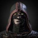
Classic Sub-Zero
Fan Kreations
Pages: 1
Classic Sub-Zero
| Artist's Remarks: | |
|
*gasp!* Not a render? Believe it or not, I CAN draw too. Whether I can draw well or not remains to be seen. It's been awhile since I drew my fave Subby, so I thought I'd try him again. I liked how he turned out.
|
| Full Scale | 618x800 | Category | Drawings (Digitally coloured) | User Views | |
| User Likes | User Ratings | 8 | Score |
|
I shouldn't be one to critique since all my drawings turn out like a 3rd grader drew 'em... but I will just say something from looking at it...
The legs to me don't the rest of the body. I like the upper body... the ninja like pose and the ice suit the drawing well. However, then there are the big, tent stake like legs that point and look funny. I dont know, maybe I'm wrong... but to me it just doesn'tlook right.... awkward in fact,
The legs to me don't the rest of the body. I like the upper body... the ninja like pose and the ice suit the drawing well. However, then there are the big, tent stake like legs that point and look funny. I dont know, maybe I'm wrong... but to me it just doesn'tlook right.... awkward in fact,
Pretty good. Like he said before me, his legs don't look right. Too chunky to me. Actually his whole body looks pretty chunky compared to teh size of his head. His left eye is lopsided too (mean the left eye from his perspective, the right eye on ours). I like the forming of the ice ball around his hands, very MK Movie like. 3/5
0
i prefer your render...
this sub zero have a too comic-ish appeal(over muscoled,bigger,badder) and as said before i think that his legs doesn not fit to the rest of the body.
this sub zero have a too comic-ish appeal(over muscoled,bigger,badder) and as said before i think that his legs doesn not fit to the rest of the body.
Thanks for the feedback so far.
I think it's odd, 'cause the legs were the things I was most happy with. But, then again, I wasn't going for a realistic style at all. I was going for the overly-developed, comicy-version, so that was a conscious decision and not an overlooked mistake. I guess it didn't pan out as well.
The eye, believe it or not, isn't crooked. I didn't center the glow from his eye just right, so it looks slightly out of place, but it is in proportion to everything else. That's a coloring error on my part.
I'm glad people liked my renders, but the well's almost dry on those... so you'd better get used to seeing big, beefy characters like this. Bwa ha ha!
Pages: 1
© 1998-2025 Shadow Knight Media, LLC. All rights reserved. Mortal Kombat, the dragon logo and all character names are trademarks and copyright of Warner Bros. Entertainment Inc.


